A university website redesign is one of the most impactful moves an institution can make to attract and engage students.
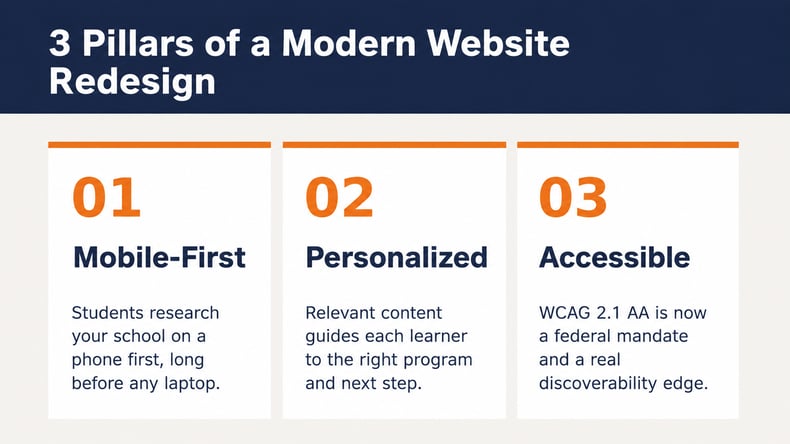
- Students research institutions on their phones, so a mobile-first, fast-loading design sets the baseline for engagement.
- Personalization and clear student journeys turn passive browsers into applicants by surfacing the right information at the right moment.
- Accessibility is now a federal requirement under the updated ADA Title II rule. A strong accessibility strategy also improves discoverability and conversion.
- Conversion gains come from intentional calls to action, as well as streamlined navigation and ongoing data-driven optimization.
Treat your redesign as a continuous program rather than a one-time launch, and build it around the way students actually move through education.
The website is the first real conversation most students have with an institution. Before they tour a campus, talk to an advisor or open a brochure, they're scrolling homepages on a phone screen. A university website redesign is an investment in making that first impression count. Because nearly all teenagers own smartphones, university websites need to perform just as well on mobile devices as they do on a desktop. Research also shows that 91% of prospective students use college websites to research institutions, but one in four say it's difficult to find information about specific majors or programs.
This guide breaks down what makes a university website effective, from the design trends that improve engagement to the practical steps that turn visits into applications. The throughline is a shift in who institutions are designing for. Today's students are Modern Learners: individuals who move in and out of education throughout their lives, gaining experience and evolving their path as their goals change, rather than following a single linear route from school to career. Designing modern higher ed web experiences means meeting those learners wherever they happen to be in that journey.
Why Does a University Website Redesign Matter Now?
Higher ed is in a complicated moment. Total enrollment grew modestly in recent terms, yet that growth hides a widening gap. Community colleges and public universities are gaining ground while many private institutions are losing it. A demographic shift is shrinking the pool of traditional college-age students, so every prospective student interaction carries more weight than it did even a few years ago.
When a student lands on a website that’s outdated, slow or confusing, they rarely email an institution about it. They simply move on to the next institution. Your website is doing recruiting work around the clock, and a redesign decides whether that work helps you or costs you.
The old model treated the student lifecycle as a one-time, linear funnel: enroll, graduate, done. That model no longer matches reality. Learners move in and out of education, not through it once, returning for new skills and credentials as their careers evolve. A redesign is a chance to rebuild around that continuous modern learner journey instead of a single enrollment moment, which is exactly what current university website trends are pushing institutions to do.
What Makes a University Website Effective?
An effective university website does four jobs well, and they map directly to what institutions must get right across the modern learner journey. A site should help learners Discover the right programs, Plan a clear path toward action, Engage with an institution’s community and Evolve with the institution as their goals change over time. When a website nails those four jobs, every other metric tends to follow.
In practice, effective college website design comes down to a few fundamentals:
- Clarity over comprehensiveness. Organize content around what visitors want to do, like "explore programs" or "plan a visit," instead of mirroring the institution’s org chart.
- Speed and stability. A fast, reliable site signals competence before a single word is read.
- Trust and warmth. Real student stories and an authentic voice help institutions feel like places where learners belong.
The strongest sites guide visitors along a clear path rather than dropping them into a maze. Guided pathways models are a great example of this, presenting students with a logical, supportive route from interest to enrollment.
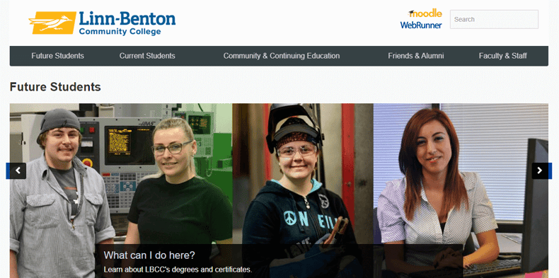
Linn-Benton Community College is a pioneer in guided pathways.
Which Design Trends Improve Student Engagement?
The most effective university website trends aim to reduce friction and make students feel understood. You don't need to chase every shiny feature. You do need to get the fundamentals right and layer in the experiences students expect. Here are the trends shaping today's strongest higher ed digital experience.
Is Your Site Built Mobile-First?
Mobile-first design isn't optional anymore. With many students online almost constantly, mobile performance is no longer optional for university websites. Designing for the smallest screen first forces clarity because there's no room for clutter.
Effective mobile-first design means:
- Thumb-friendly navigation designed for mobile use.
- Forms built for mobile keyboards that are quick to complete.
- Content structured for vertical scrolling that makes information easier to scan.
It also means speed, since a slow load on a cellular network is often enough to send a prospective student elsewhere. When you get the mobile experience right, the desktop experience tends to improve along with it.
Does Your Website Personalize the Experience?
Personalization is a baseline expectation. Students who grow up with tailored feeds and recommendations expect the same experience from a college or university, and a majority expect personalized digital content from the colleges they research.
Strong personalization starts with simple segmentation: distinct paths for first-year applicants, transfers, graduate candidates and returning adult learners. From there, behavioral signals allow institutions to automatically surface relevant programs based on each learner’s interests and behavior. Institutions that personalize see meaningfully higher clickthrough and turn anonymous traffic into guided journeys.
Is Your Website Accessible to Every Student?
Accessibility is one design priority institutions can no longer afford to overlook. Roughly one in five undergraduates reports having a disability, which means web accessibility for universities is fundamental to reaching the full audience.
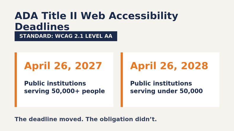
It's also the law. The Department of Justice's updated federal accessibility rule requires public institutions to bring their websites and mobile apps into conformance with WCAG 2.1 Level AA. In April 2026, regulators gave public colleges another year to comply, moving the deadline to April 26, 2027 for larger entities and April 26, 2028 for smaller ones. The extension changed the date, not the obligation. A redesign that bakes in accessibility helps institutions stay ahead of both the deadline and the competition.
There's a bonus most teams miss. Accessible sites are easier for search engines and AI tools to read, so accessibility doubles as a discoverability strategy that helps the website show up where students are searching.
Do Virtual Tours and Video Bring Campus to Life?
Video and interactive tours let institutions tell their story to students who can't visit in person, which is a growing share of the audience. Authentic footage of campus life builds emotional connection in a way text can't match. A clear majority of students feel more likely to apply after completing a virtual tour.
The best implementations combine guided video with self-directed maps and mobile-optimized playback. Features like captions for accessibility and adaptive streaming all help students engage on their own terms. Done well, a virtual tour becomes the next best thing to standing on the quad.
Does Your Visual Identity and Navigation Make Finding Information Effortless?
A visual identity is the first impression, communicating quality and personality before a visitor reads a word. Strong college website design balances professional credibility with warmth, using a consistent visual identity that works across screen sizes. Bold, high-contrast choices and generous white space help students focus on what matters.
Navigation has to match that polish. Organize content around user intent, then support it with clear labels and effective search. When visitors can find what they need without thinking about it, they stay longer and act sooner.
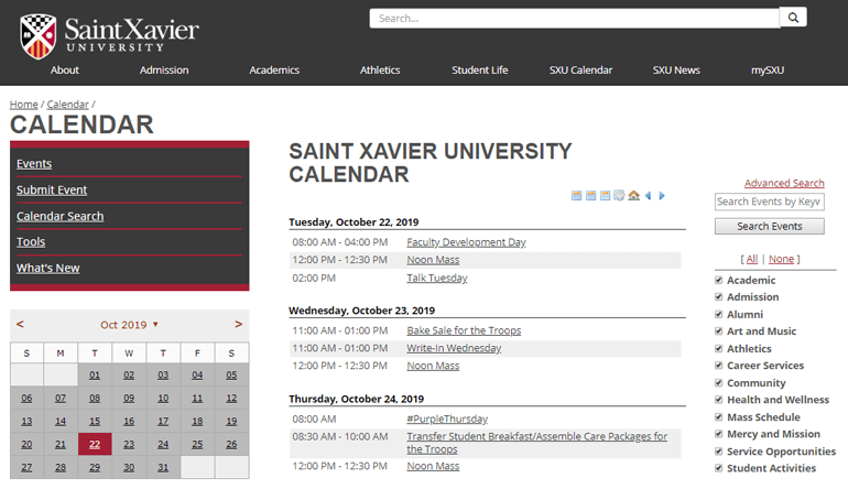
Image courtesy of Saint Xavier University
How Do Universities Improve Website Conversions?
Engagement is the goal, but conversions are the proof. Improving conversions starts with removing friction from key actions, whether that’s exploring a program or starting an application. Every extra click, confusing label, slow-loading form or broken link is a place where motivated students drop off.
A few moves consistently lift conversion rates:
- Make calls to action obvious and action-oriented. "Apply now" and "request info" should never be hard to find.
- Streamline high-intent paths. Audit every step prospective students take before applying, removing dead ends and unnecessary steps.
- Let data lead. Use A/B testing and visitor behavior to guide ongoing improvements.
Personalization deserves a callout here too, since relevant content keeps students moving toward the next step instead of bouncing. When a site adapts to a visitor's interests, it feels less like a brochure and more like a guide, and guided visitors convert.
How Can You Plan a Successful University Website Redesign?
A successful redesign is a program, not a project. The institutions that get the most from their investment treat student-centered website design as an ongoing discipline rather than a launch-day finish line. These steps keep the work grounded:
- Start with a mobile and accessibility audit. Know exactly where the current site stands before changing anything.
- Build a small cross-functional team. Marketing, IT, accessibility, admissions and a student voice belong at the table from day one.
- Choose your platform deliberately. The Content Management System (CMS) shapes everything that follows, so evaluate it for accessibility enforcement and personalization, along with how easy it is to manage every day. A purpose-built higher ed CMS prevents many problems before they start.
- Design around the student journey. Map real personas and the paths they take, then organize content to support those paths.
- Establish governance. Decide who owns the standards so the site doesn't drift into chaos within months.
- Plan to iterate. Use analytics and user feedback to keep improving long after launch.
These higher ed website best practices protect the investment and keep the experience fresh as student expectations evolve. The teams that succeed align stakeholders on goals and ownership before any design work begins, which prevents the scope creep and rework that can stretch timelines.
Frequently Asked Questions
How long does a university website redesign take? Timelines vary with scope. Focused projects can launch in three to six months, while large institutional redesigns commonly run 12 to 24 months. The biggest delays come from skipping early alignment on priorities and ownership, so invest time upfront to save it later.
What's the most important trend to prioritize? Mobile-first design is the foundation that enables everything else. Because most students research on a phone, a site that fails on mobile undermines every other improvement you make. Accessibility is a close partner, since it's both a legal requirement and a discoverability advantage.
How does a redesign improve enrollment? A redesign improves enrollment by simplifying the journey from program discovery to application. Clear pathways and personalized, intuitive experiences reduce the friction that causes prospective students to drop off, which turns more visits into inquiries and completed applications.
Can small colleges compete with large universities online? Absolutely. Smaller institutions often have an edge in personalization and authentic storytelling that larger ones struggle to match. Focus on what makes the institution distinctive, from its community to the outcomes it delivers, rather than imitating resource-heavy features.
Ready to Redesign Around the Modern Learner?
A great university website redesign isn't a one-time refresh. It's an ongoing commitment to meeting students wherever they are in a journey that no longer follows a straight line. When you design for the modern learner, you build a higher education digital experience that supports discovery, planning, engagement and lifelong connection all at once.
Modern Campus partners with institutions to connect the systems, content and experiences that support learners from first click through lifelong learning. Book a personalized demo and see what that partnership can do for your institution.
Last updated: August 5, 2026