Best College Websites of 2021: What These Schools Did Right
Ready for a website redesign? See how these best college, university and higher education websites are maximizing their web pages to reach prospective students and offer a great user experience.
- University of North Carolina School of the Arts
- Murray State University
- Harper College
- Western Kentucky University
- Stony Brook University
- Pasadena College
- California State University Channel Islands
- Morehouse School of Medicine
- Franklin Pierce University
- Juniata College
Don’t go it alone! Contact a Modern Campus expert to schedule a demo and learn more about setting the foundation for a great website.
University of North Carolina School of the Arts: Best Award-Winning Design
From a succinct, on-point message to dynamic videos, the University of North Carolina School of the Arts (UNCSA) draws prospective students into their website then provides them with pathways to their chosen topics.
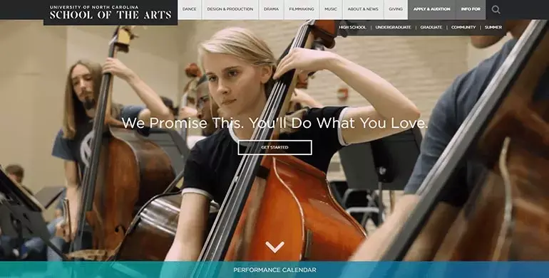
University of North Carolina School of the Arts has an award-winning design with several striking features.
Image courtesy of North Carolina School of the Arts.UNCSA uses full-screen images that give prospective students, parents and families insight into what it feels like to attend the university. And they don’t stop with pictures. A variety of pathways that students can click through lead them to information specific to their desired topic.
UNCSA achieves this by:
- Keeping content simple
- Making content direct
- Ensuring content is easy to navigate and follow
These design elements combine to make the University of North Carolina School of the Arts’ award-winning website.
Murray State University: Best Easy-Access Calendar
College and university campuses struggle with calendars because there are so many events—and they are changing all the time. Consequently, many schools resort to using a boring calendar listing to advertise. Murray State University solved this problem with an easy-access calendar that transforms events into a beautifully tiled page.
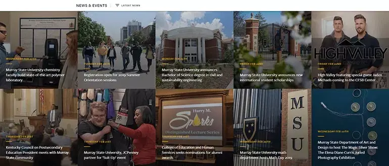
The best college websites feature easy-access calendars like this one from Murray State University.
Image courtesy of Murray State University.Murray State University’s website calendar entries feature:
- Date
- Title
- Description of the event
- Cost
- Images when available
Upon clicking through to the unique event page, site visitors can choose to add the event to their personal calendar. The best part of Murray State University’s calendar is that it is accessible from the home page.
Website calendars are an effective way for colleges and universities to keep their students aware and involved and to help prospective students imagine what their student life would be like on your campus. A good website calendar should integrate with your college CMS and allow for multiple contributors. Seek a vendor that offers a CMS and calendar module that work seamlessly together.
Harper College: Best Interactive Course Catalog
There’s nothing fancy about Harper College’s Course Catalog—and that’s the beauty of it. The top navigation is simple: Course Descriptions or Programs of Study. However, students can delve by exploring detailed course descriptions or by choosing a program area and investigating the classes required to complete a particular major.
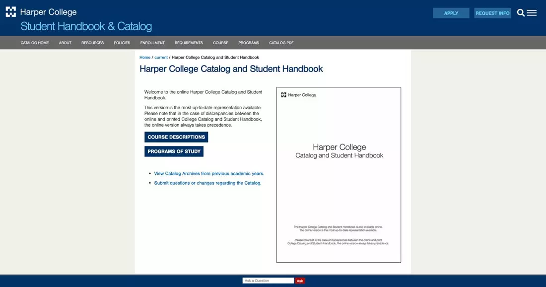
The best college websites like Harper College’s include an interactive catalog that makes it easy for students to navigate for more detailed information.
Image courtesy of Harper College.Harper College takes it a step further than their current course catalog. From the catalog home page, students can:
- Search by course descriptions
- Search by program area
- “Ask a Question” if they get lost
- Link to older editions of the catalog
A good course catalog should integrate with your CMS and allow you to build the infrastructure you need for a dynamic higher ed web design.
Western Kentucky University: Best Virtual College Tour
These days, students are applying to several colleges—and many are located several hours away. This makes it essential for university and college websites to have dynamic virtual college tours of their school online.
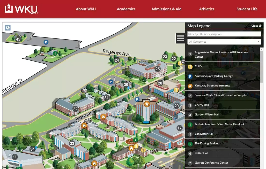
The best virtual college tours like Western Kentucky University’s give students tools and resources to gain a better understanding of campus life, and all the school has to offer.
Image courtesy of Western Kentucky University.The Western Kentucky University website boasts a virtual tour with an interactive map that features:
- Photographs of locations
- Descriptions of locations with links to additional information
- A search box that allows students to search by description, title, or category
Being able to see the layout of the campus, interact with a map, and learn the history of campus landmarks helps students see themselves as a fit for your school.
Stony Brook University: Best Page for Attracting Boosters
Stony Brook University recognizes alumni and boosters as an essential audience for their website.
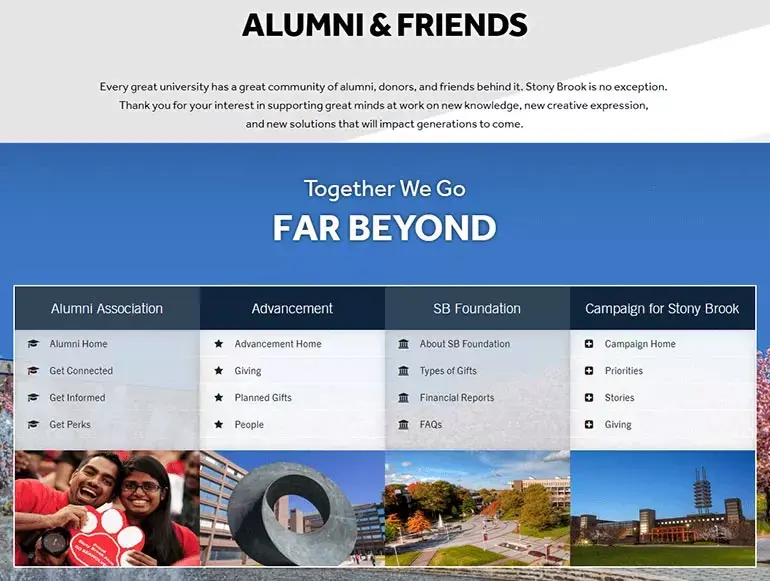
Alumni and friends feel at home on Stony Brook University’s comprehensive boosters page.
Image courtesy of Stony Brook University.Stony Brook’s slogan for their alumni and friends page, “Far Beyond Giving,” emphasizes ways beyond donating that alumni and boosters can engage and connect beyond college. This includes:
- A calendar specific to events of interest to alumni and boosters
- Reunion news
- Homecoming information
- Online newsletter
- Perks exclusive to Stony Brook alumni
Stony Brook works hard to include alumni long after they graduate, a strategy that no doubt pays off during capital campaign time.
Pasadena College: Best Easy-to-Use Admissions Page
Even though Pasadena College reviews 40,000+ applications each year, their college admissions process is as easy as 1-2-3, with pathways specific to each student’s journey.
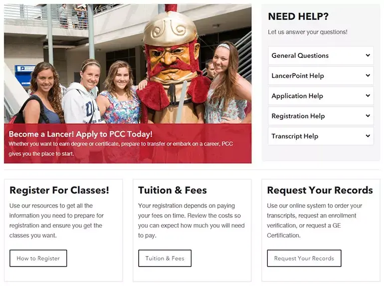
There’s no room for guessing on Pasadena City College’s easy admissions page. The steps are clearly delineated, making it easy for prospective students to figure out their admissions path.
Image courtesy of Pasadena City College.College admissions websites should ask: What type of student are you? Pasadena College does this by including all student options:
- First Time College Student
- Returning PCC Student
- Concurrent Enrollment
- Previous College Student
- Noncredit Student
- International Student
Additionally, Pasadena College addresses frequent questions right on the page, such as open enrollment, eligibility, and whether there are special programs for the disabled and veterans.
California State University Channel Islands: Best Emergency Messaging
A good web CMS will have an emergency alert module that allows colleges and universities to communicate quickly and easily with their varied audiences. California State University Channel Islands learned this lesson last year when fires swept through the area.
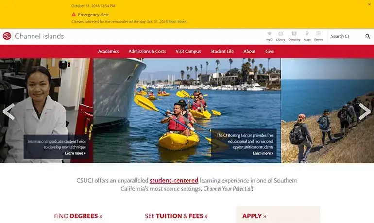
California State University Channel Islands notified its community about school closures by posting an emergency alert to the home page of its website.
Image courtesy of California State University Channel Islands.California State University Channel Islands’ website emergency alerts system makes it easy to:
- Publish high visibility announcements that can be pushed out to social media platforms
- Post an alert while on the go if necessary due to its mobile-first design
- Manage alerts via a stand-alone mobile interface, meaning someone in campus security doesn't have to be trained in how to use the full CMS or module
- Create authority levels so you can designate who can post alerts
You won’t appreciate the full value of having an emergency alerts system in place—until you need it.
Morehouse School of Medicine: Best Comprehensive News and Events
Busy students, faculty, and administrators have little time for catching up on college and university news, so Morehouse School of Medicine designed a page that makes it easy to keep up with events and current news.
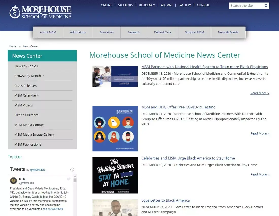
Morehouse School of Medicine has one of the best higher education sites because it provides all current news and events on one convenient web page.
Image courtesy of Morehouse School of Medicine.The Morehouse News Center features:
- Current news stories with links
- The Morehouse calendar
- Feeds from social media platforms
- Comprehensive search by topic or date
- An archive of stories
- An image gallery
- Links to school publications
No more hunting for information with the all-in-one News Center at Morehouse.
Franklin Pierce University: Best Messaging Using Hero Image Slider
Rather than choosing one story to highlight, Franklin Pierce University maximizes the use of the hero image slider by presenting several prominent news stories in a large area at the top of their home page.
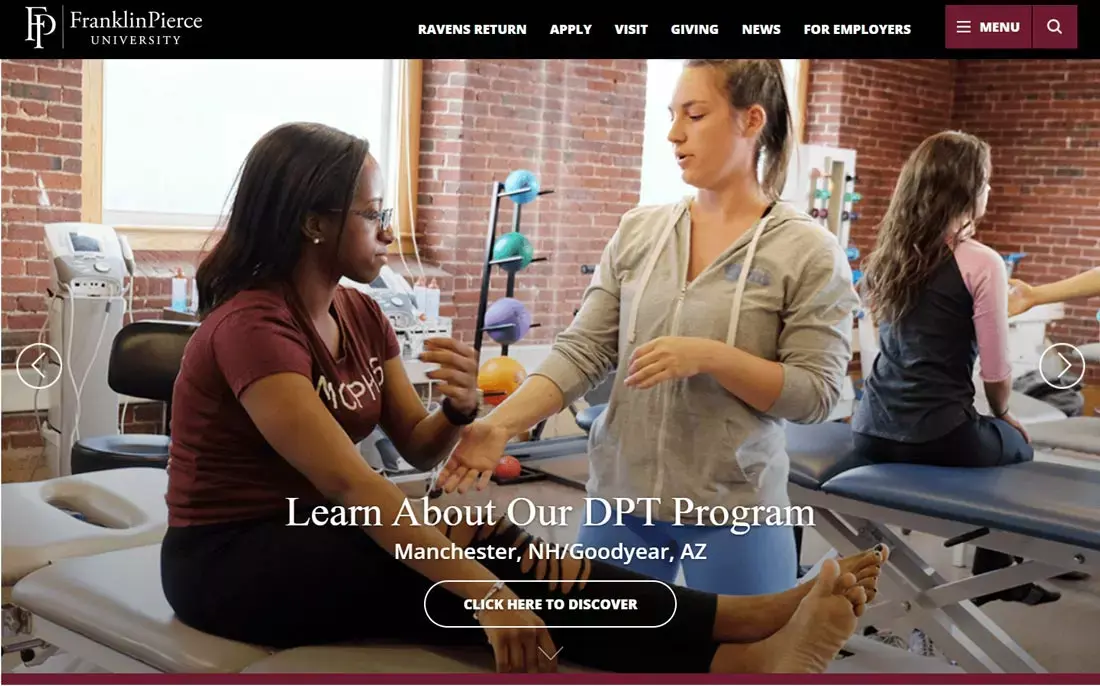
When you can’t decide what story should receive top priority on your web page, take a cue from Franklin Pierce University and display them all using a hero image slider.
Image courtesy of Franklin Pierce University.A hero image slider like the one used by Franklin Pierce University lets you speak to several audiences at once:
- Academics
- Athletics
- Alumni
- Donors
- Prospective Students
- Current Students
- Parents
- Faculty
Choose colorful, appealing images, to-the-point text, and provide a link on each image so the viewer can get more information if desired.
Juniata College: Best Storytelling
Juniata College speaks directly to a prospective student: “Become the Author of Your Own Powerful Story.” With that call to action, students are immediately drawn into the site and encouraged to explore the post-graduate successes of the Class of 2018.
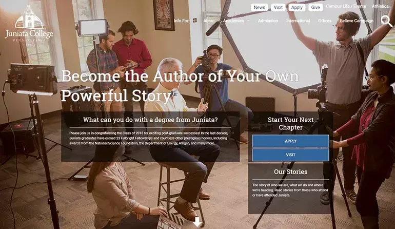
The story of Juniata College is unique for each student. That’s why the school immediately tries to draw in prospective students by encouraging them to consider how they will tell their story at Juniata.
Image courtesy of Juniata College.Juniata College masters the use of storytelling techniques and carries the theme through by:
- Relating to the reader: in this case, prospective students
- Providing stories of recent Juniata graduates
- Engaging prospective students to consider what they can do with a Juniata degree
- Providing a prominent “Apply” button so that students can begin their journey at Juniata
- Using an informal, conversational tone to build intimacy with the reader
The emotional edge of Juniata College’s website depicts a familiar, welcoming campus that prospective students feel a part of even when online.
So, how does your college website compare to these stellar examples? If it’s clear that your school’s website needs a refresh or complete redesign, check out College and University Website Redesign: The Ultimate Guide.

Karam Singh
Karamjeet Singh Khosa is a Content Marketing Manager at Modern Campus. With more than a decade of progressive professional experience, he has a thorough understanding of content, marketing, technology and the education industry. Prior to joining Modern Campus in 2022, he worked with leading technology enterprises, like Google, and leading education services and products providers, like Pearson Education. A digital nomad with a Master’s degree in English literature, Karamjeet loves to read, write, travel and trek.
Connect with him on LinkedIn: linkedin.com/in/karamjeetkhosa
Last updated: February 5, 2021
