Top Ten Higher Ed Course Catalogs of 2023
Course catalogs are often one of the first things students look at when checking out a higher education institution.
Knowing this, modern colleges and universities are no longer treating their course catalogs as mere exhaustive lists of courses. By adopting a holistic, student-focused approach, future-ready institutions are transforming traditional course catalogs into powerful marketing tools that attract, engage and convert prospective students.
Designed with branded visuals, interactive elements and multimedia content, these modern catalogs deliver the experience modern students expect. By featuring success stories, testimonials, the institution’s unique selling points and clear calls to action (CTAs), these catalogs move students down the enrollment funnel.
Modern Campus looked at hundreds of course catalogs, evaluated them with input from experienced registrars and academic affairs professionals and hence, picked the top ten that serve as strong marketing tools. In alphabetical order, the following are the best higher ed catalogs of 2023.
Augusta University
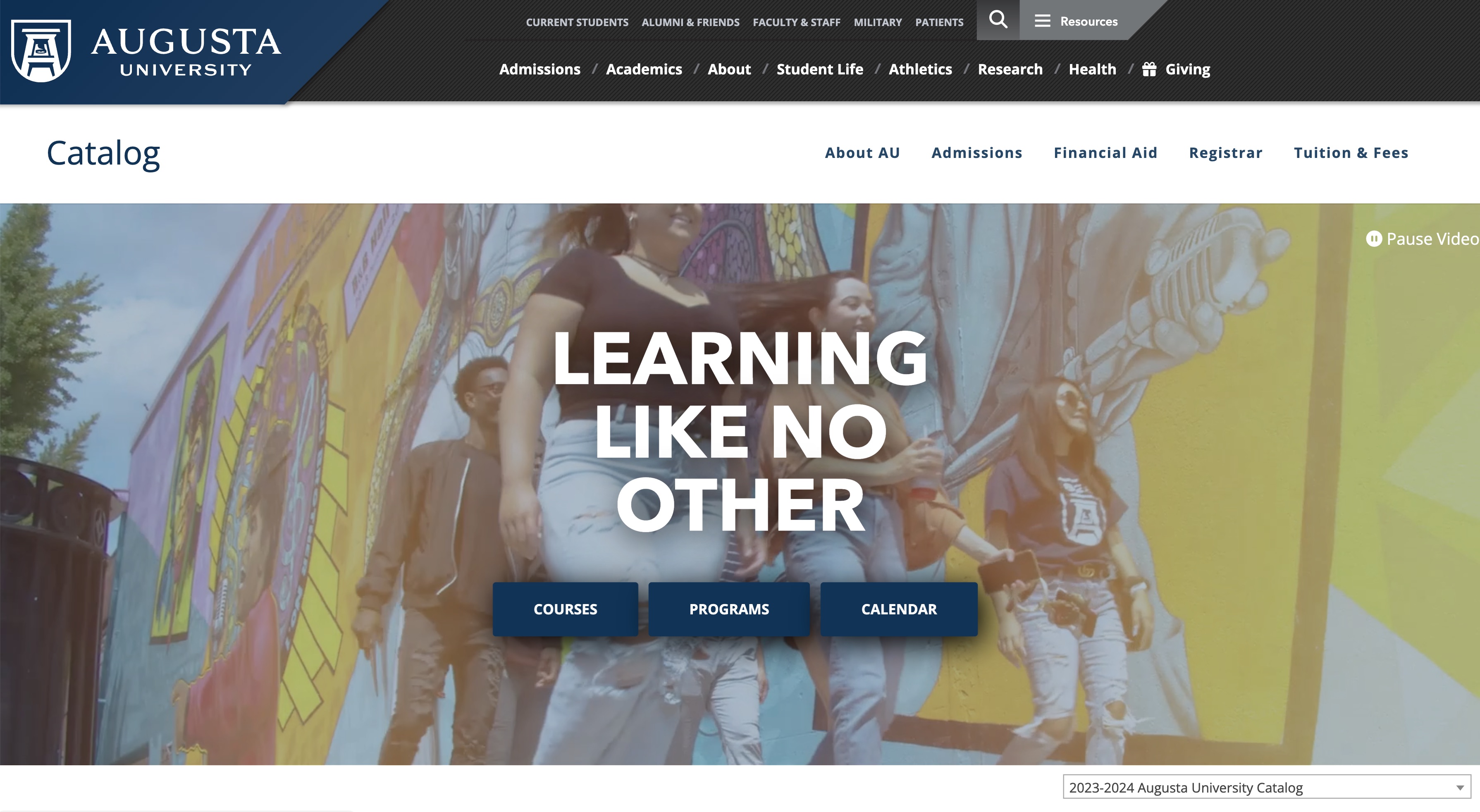
Neat and clean, with a video header
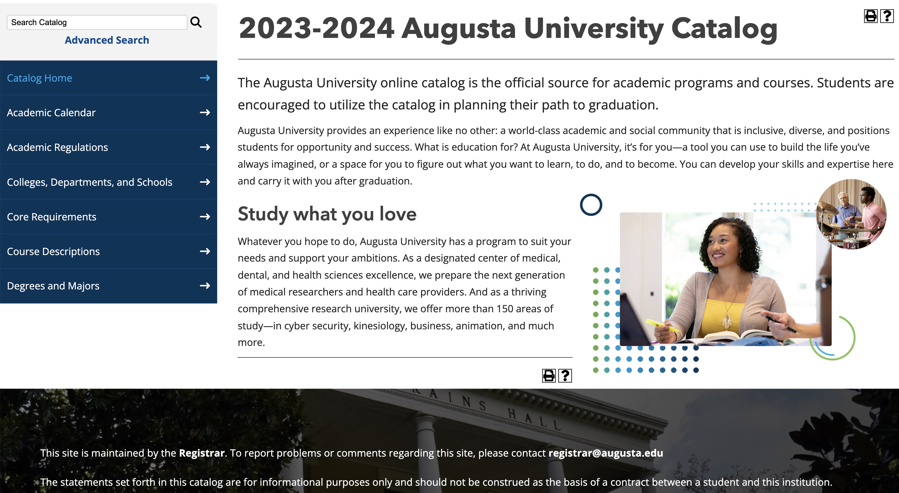
Augusta University recently revamped its catalog. It's neat and clean, with branding consistent with the institution’s website. It follows all the best practices for effective digital catalog management. With an engaging video header, it has three key CTAs – courses, programs and calendar – right at the center of the first fold.
The main fold of the page features the latest catalog with all important links neatly stacked on the left and all previous years’ catalogs tucked into a dropdown menu on the right. It’s a one-click publish catalog with an easily accessible ‘publish’ icon on the page.
Chemeketa Community College
Breathable design, helpful instructions and integrated pathways
Chemeketa Community College’s catalog scores high on user friendliness. It has an easy, breathable design that presents all the important information in a clear manner that avoids being overwhelming. On top of that, it provides clear instructions on how to navigate the catalog and find the right information.
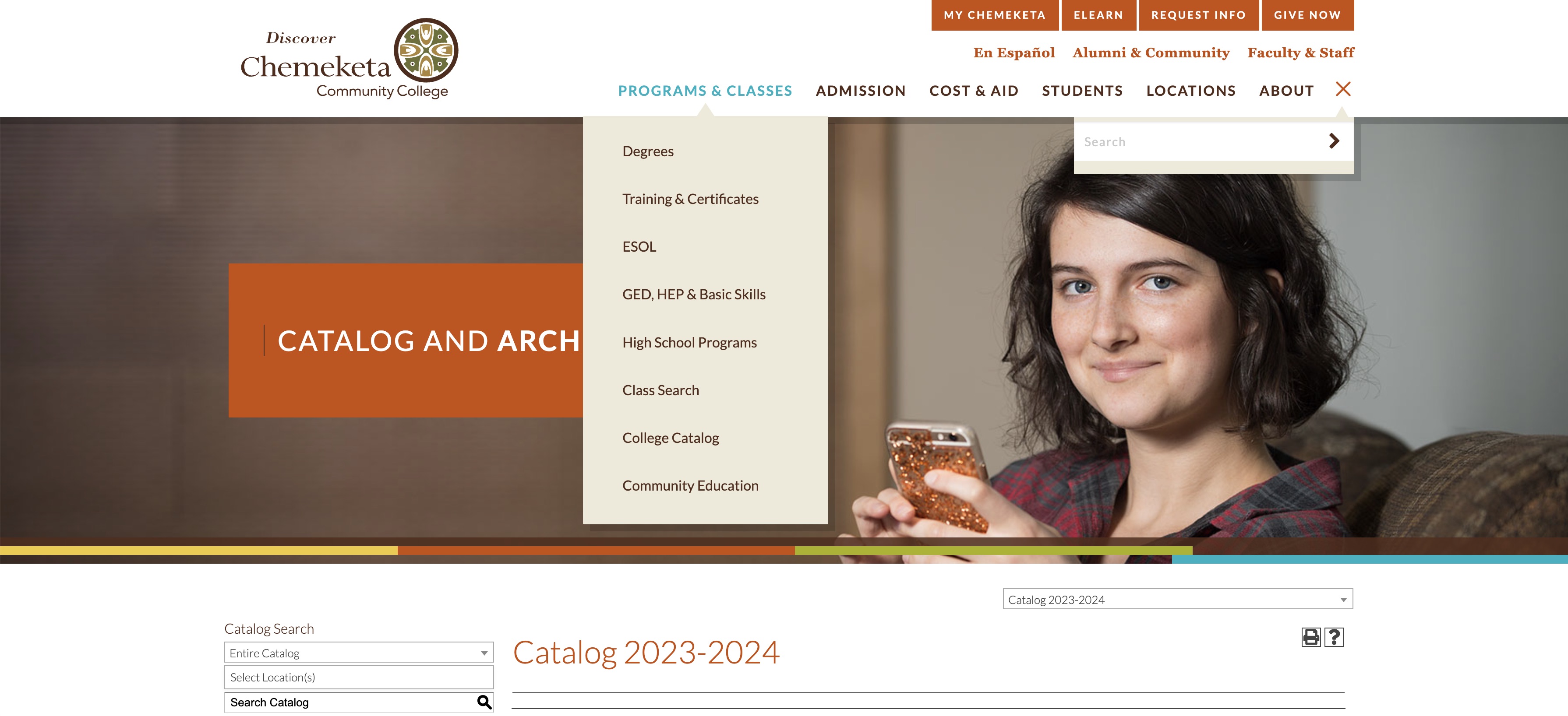
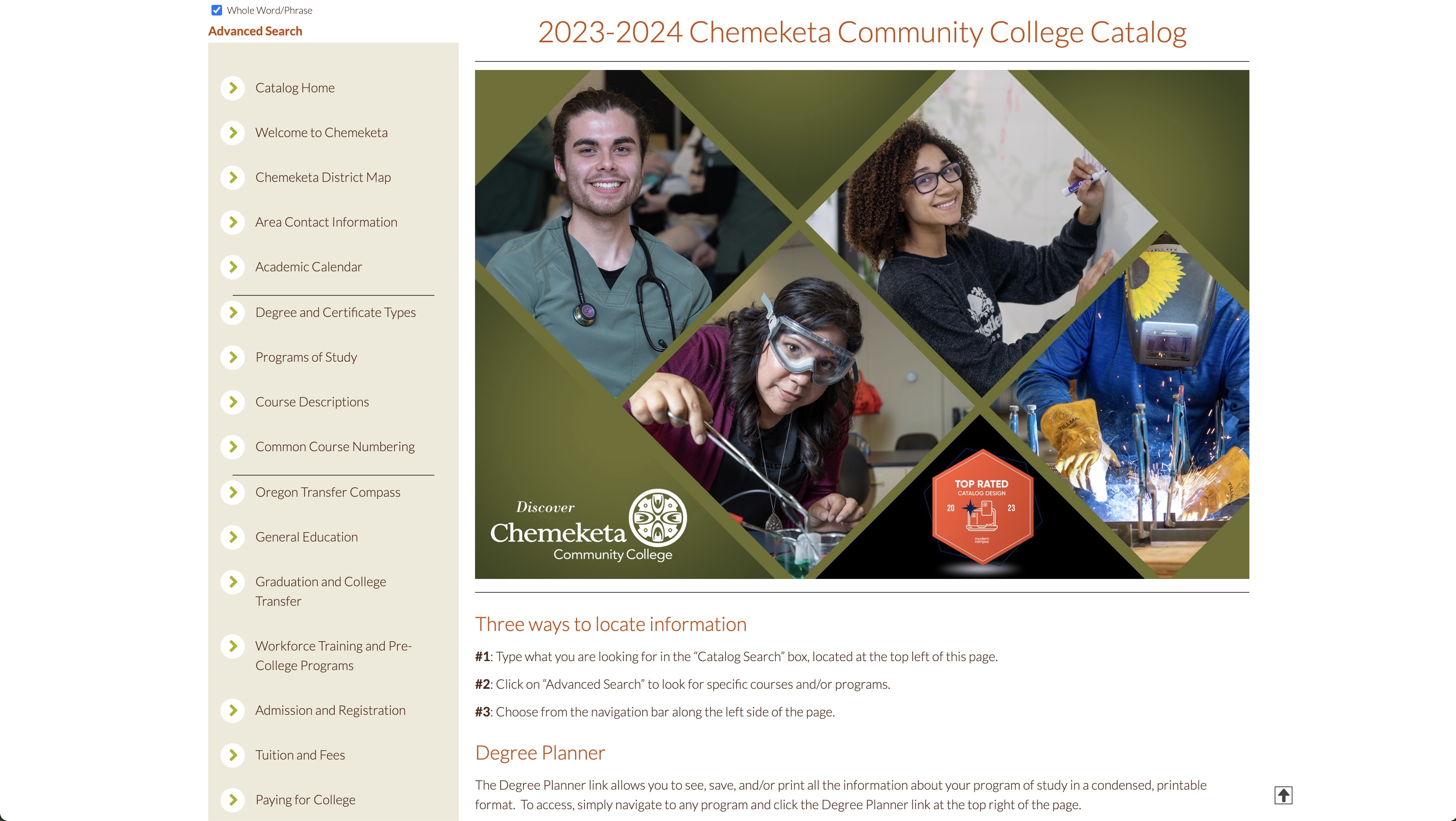
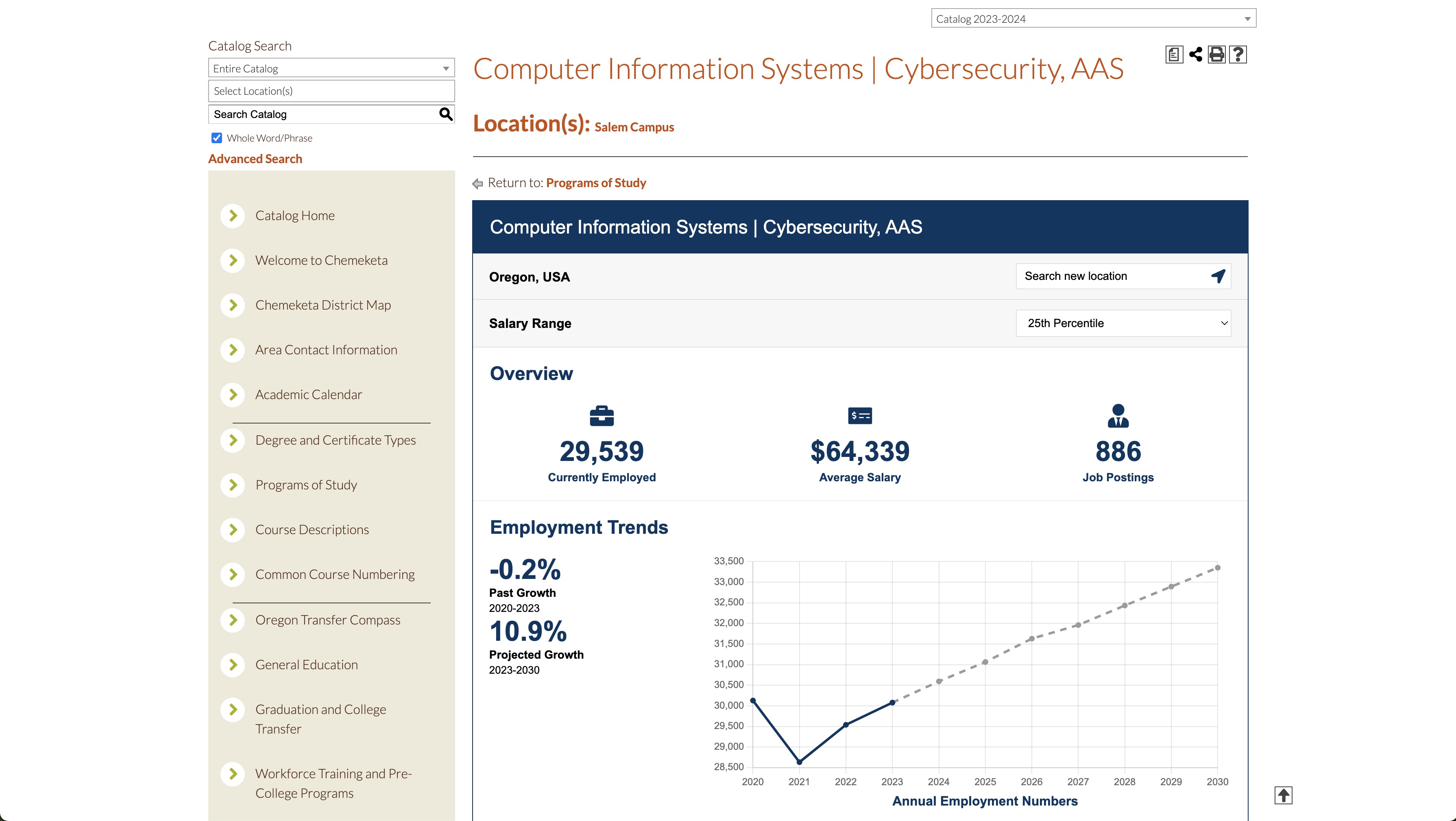
With integrated Modern Campus Career Pathways, each program page shows accurate and up-to-date career information. This information helps students evaluate their career options with potential earnings after completing a particular course/program.
Kennesaw State University
One branded catalog for degree and non-degree programs
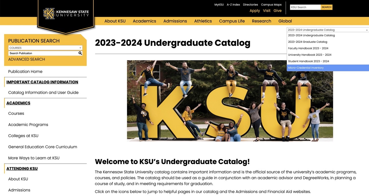
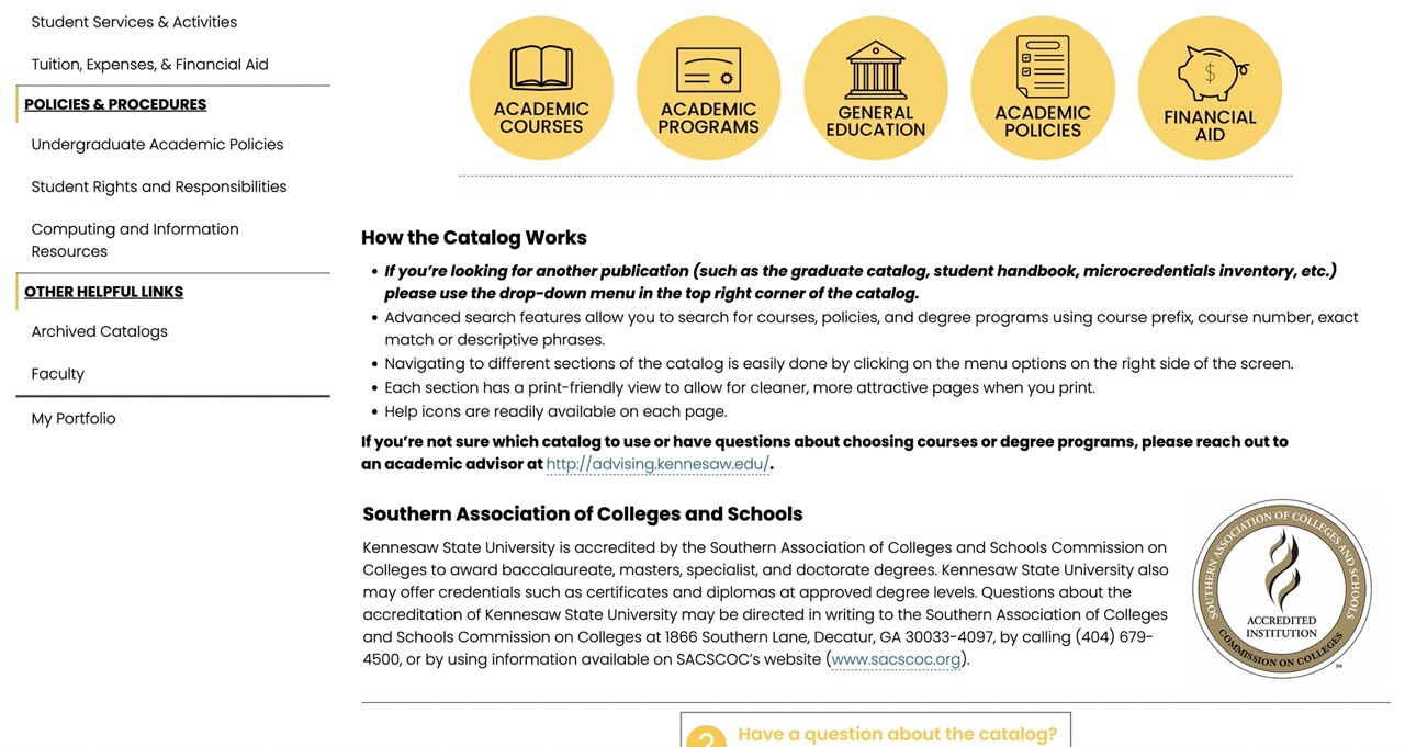
Many institutions are offering microcredentials to meet the rising demand for them. Yet, many colleges and universities struggle to properly manage their microcredential offerings. Kennesaw State University (KSU) is an exception. On the back end, KSU uses the same curriculum management platform to manage both degree and non-degree programs. On the front end, it uses one branded catalog, which lists both types of programs, and which is integrated with its website.
This clever setup allows a site visitor to seamlessly move between the website and the catalog and choose from degree and non-degree programs; the user experience stays the same. Institutions are learning from KSU to effectively manage microcredentials and catalogs. MSU Denver is one of them.
Lamar State College - Orange
Neat and clean, with integrated pathways
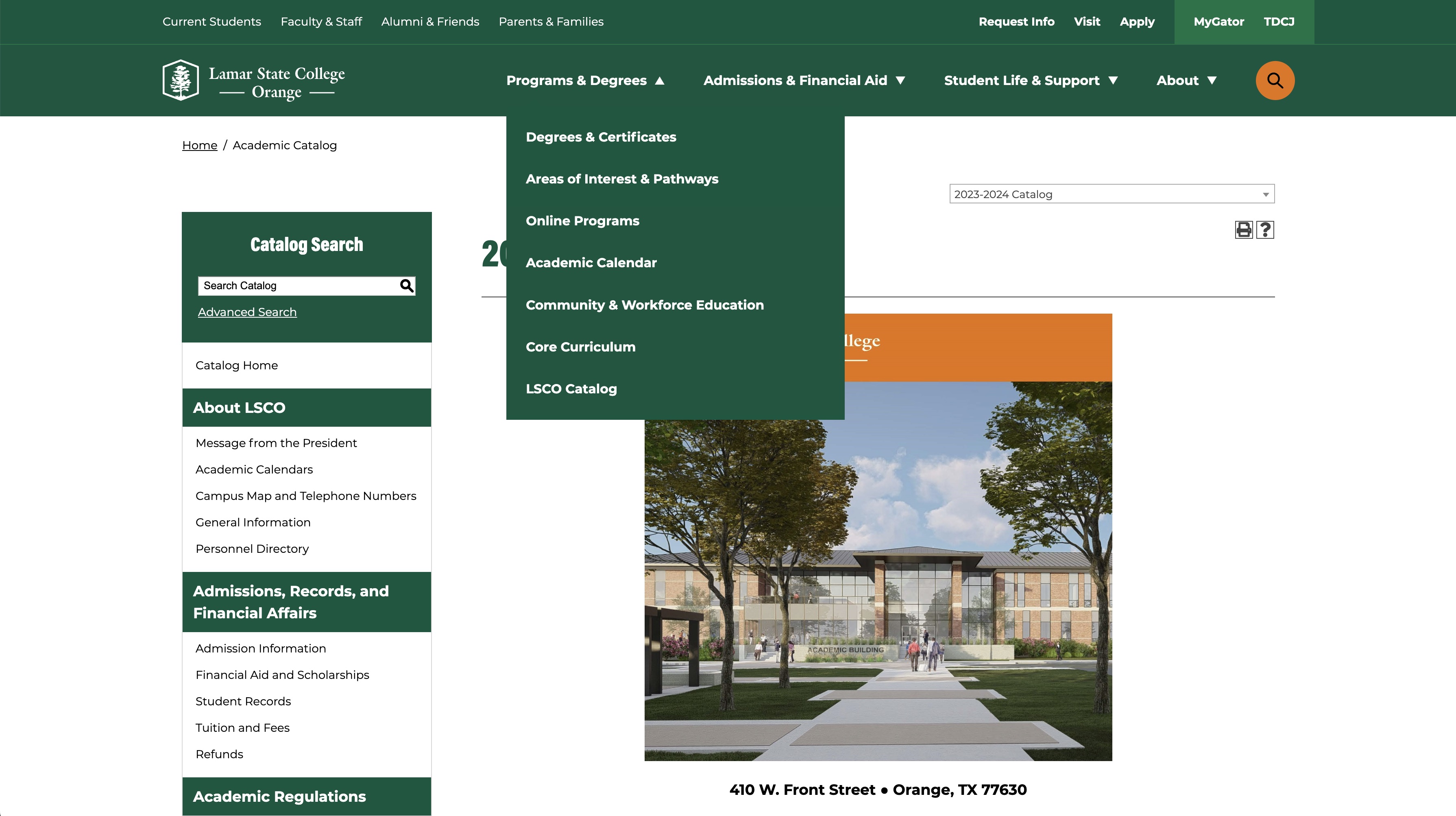
Lamar State College has a simple, clean and well-organized catalog. The use of white space with branded green and orange is well balanced. All of the most important links are organized in mega menu drop downs, with secondary ones on the left-hand side and a highlighted search icon on the top right corner, making everything super easy to navigate.
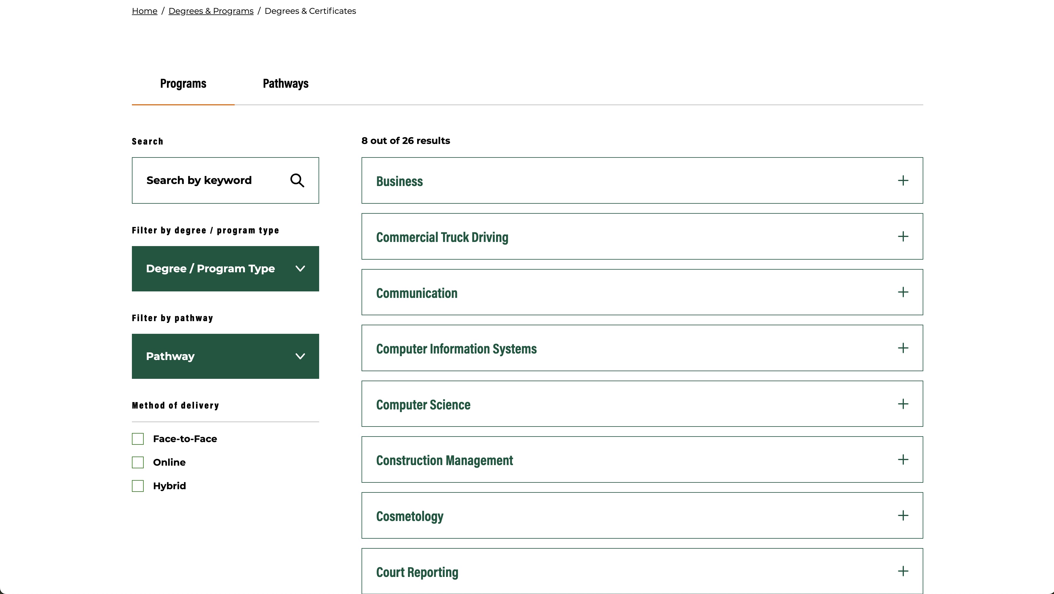
All courses are well stacked in an accordion by program types, which can be sorted by programs and career pathways.
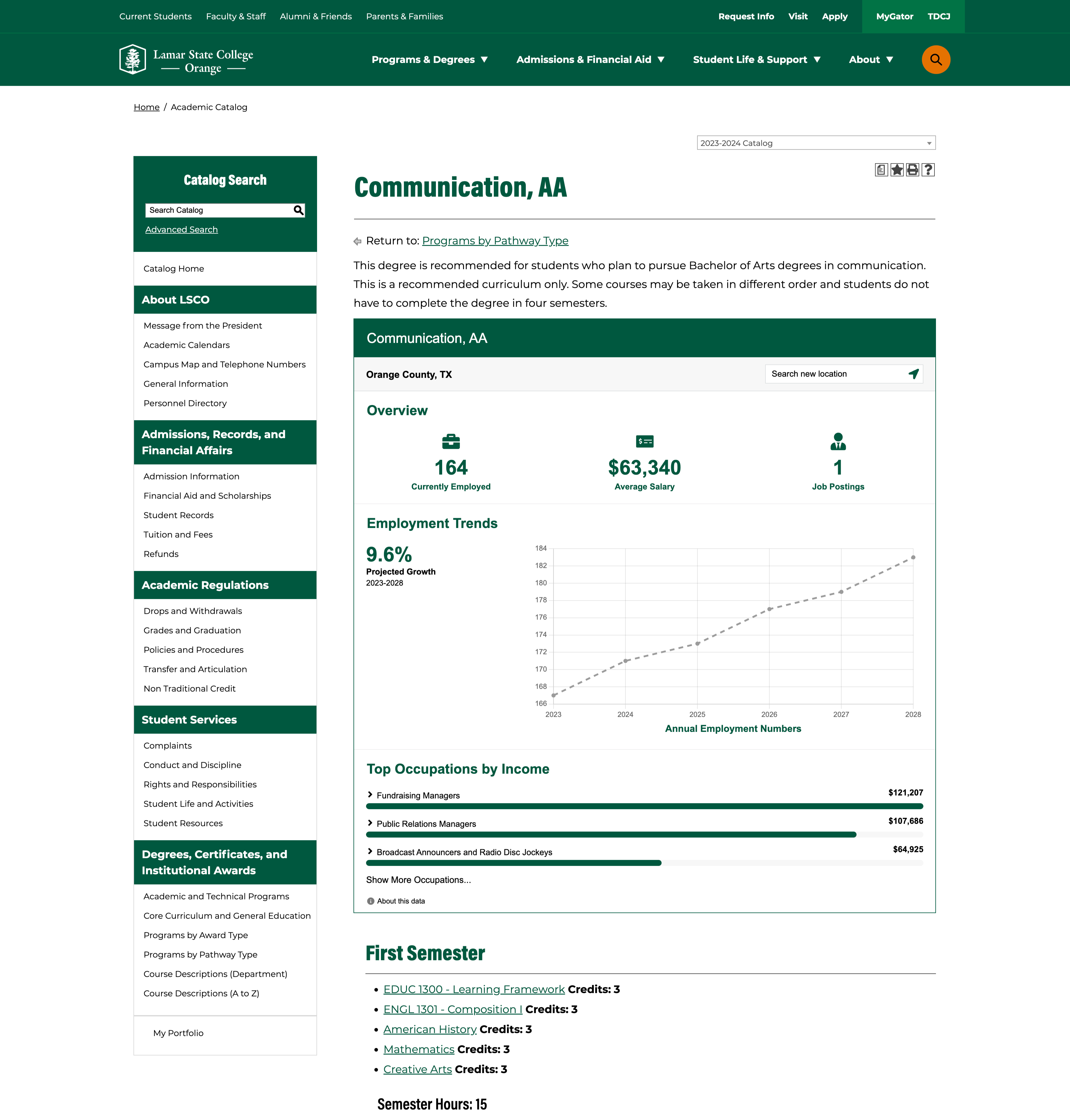
The catalog has integrated Career Pathways, supplied by Modern Campus, which show accurate and current career data on all program pages.
Purdue University
An educational and promotional digital property
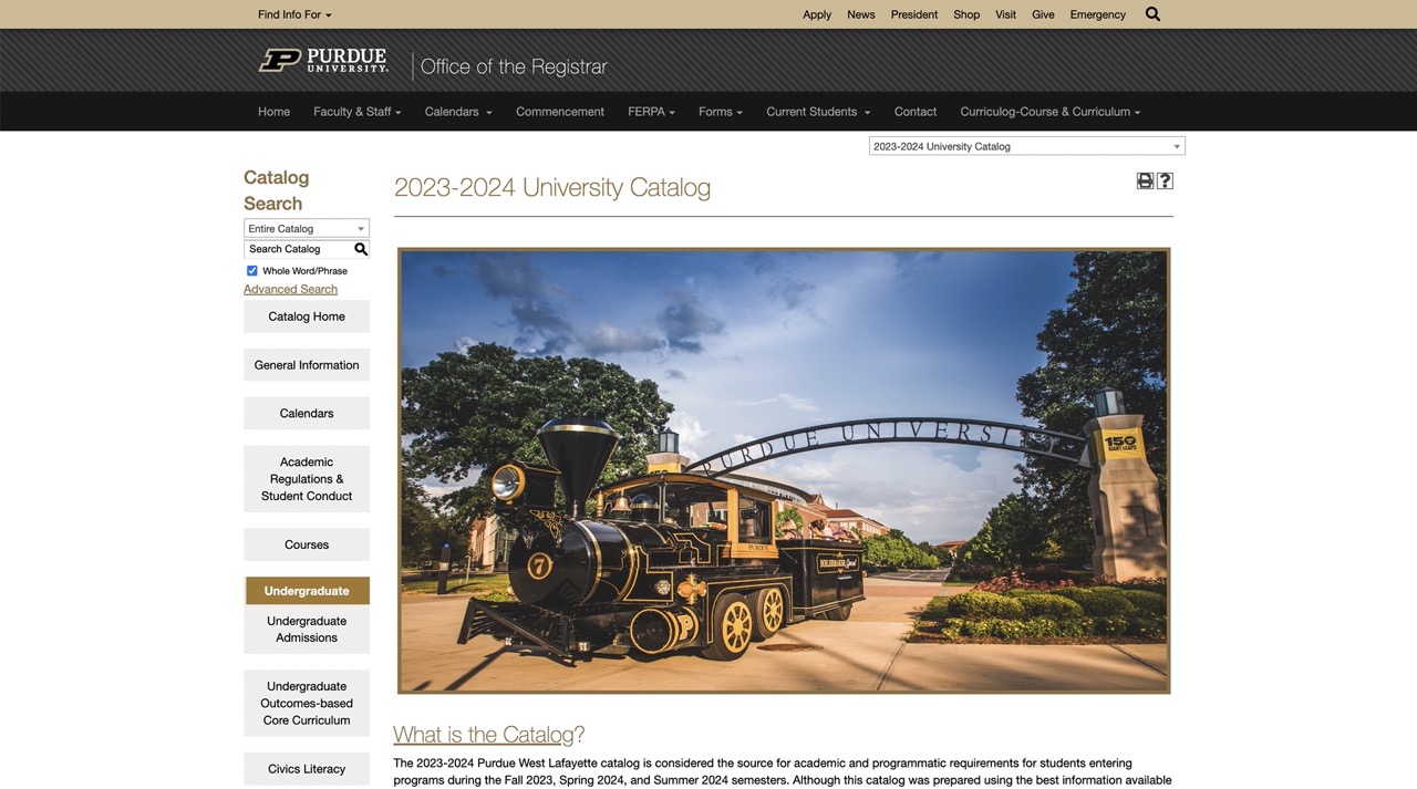
Purdue University has been using a digital catalog for a long time and uses it well to inform and educate students about its programs and to promote its brand.
Purdue introduces its catalog to prospective and new students and educates them on how to use it. With important links in the mega menu drop downs and on the left-hand column, the catalog has important definitions and directions at the center of the page.
It also uses the catalog home page to feature its 12 years of frozen fee. That’s a good example of leveraging a digital catalog to promote an advantage or selling point of the institution.
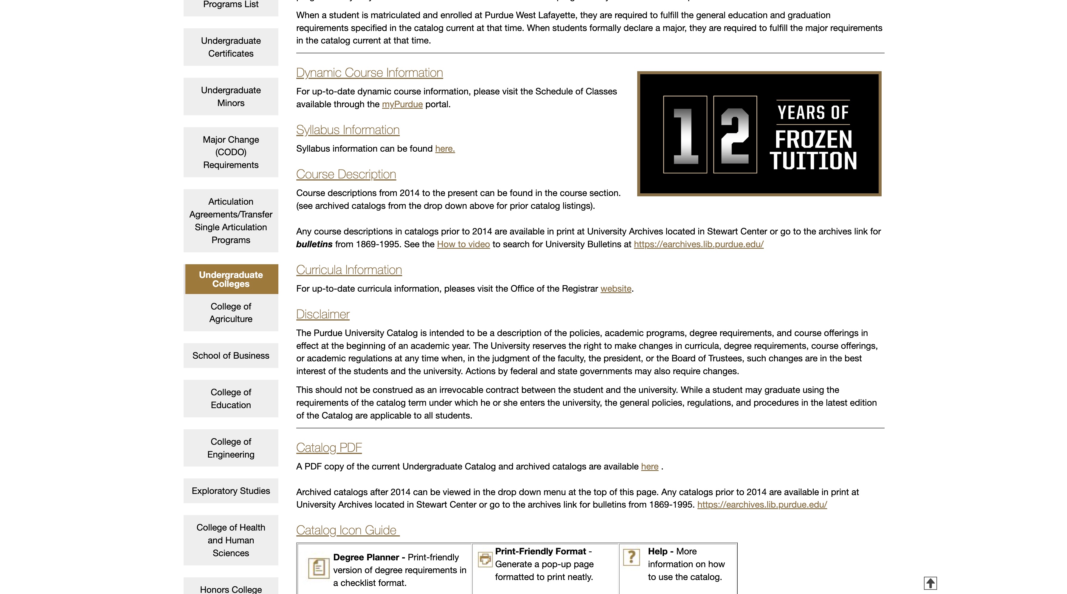
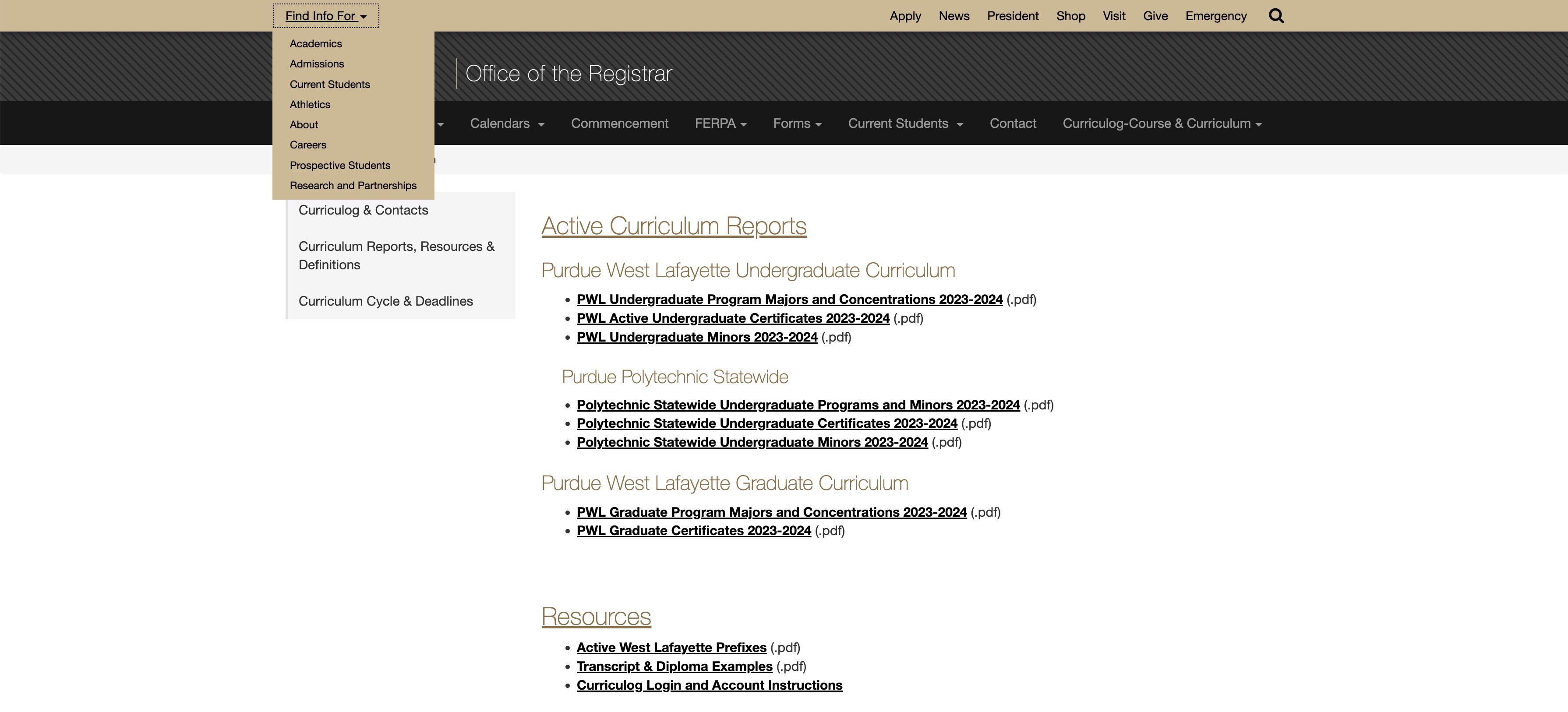
Purdue University's catalog also has an integrated curriculum management platform, which takes students seamlessly from program and course information to course curriculum.
Southeast Technical College
Program spotlight and easy navigation
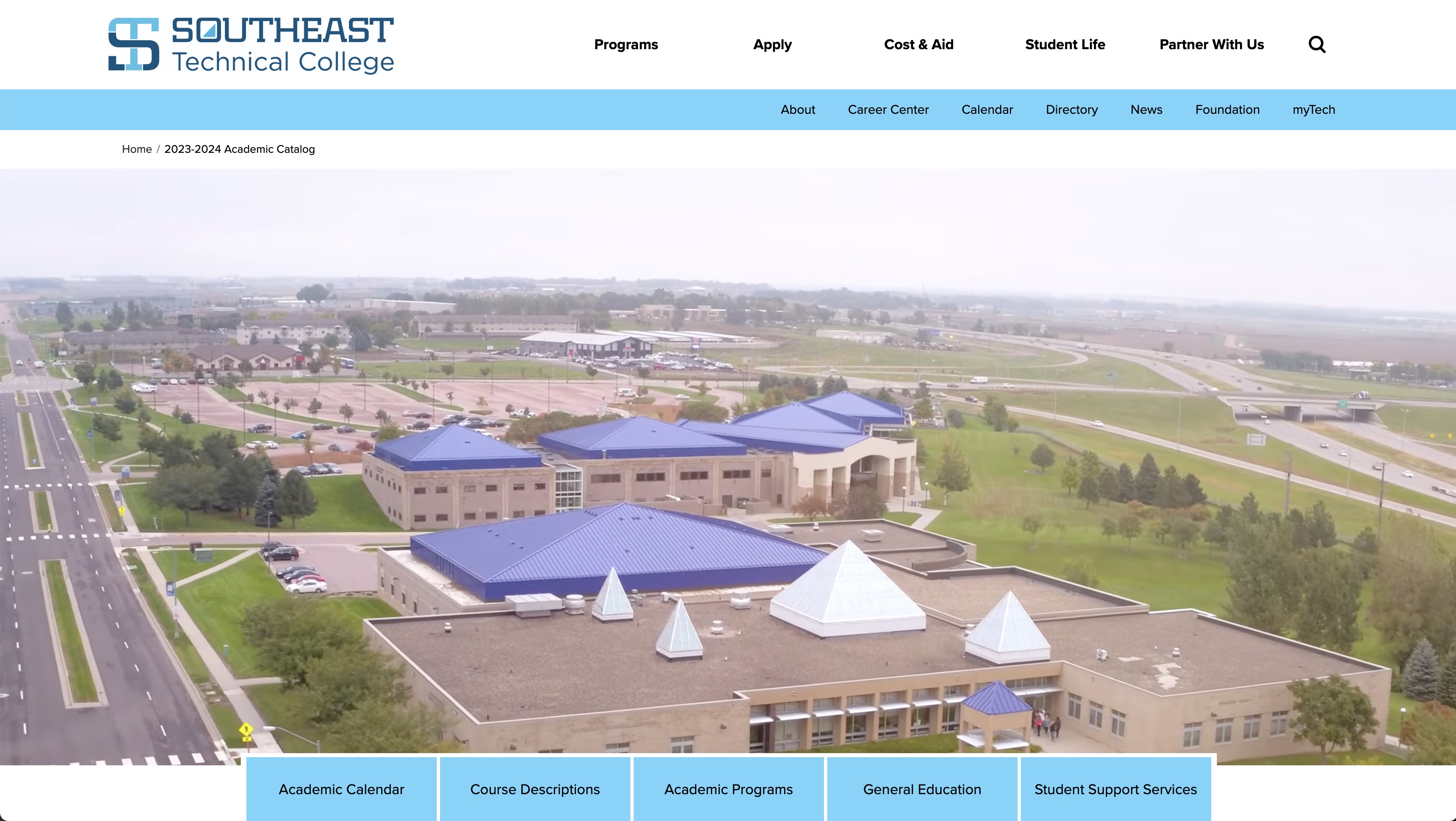
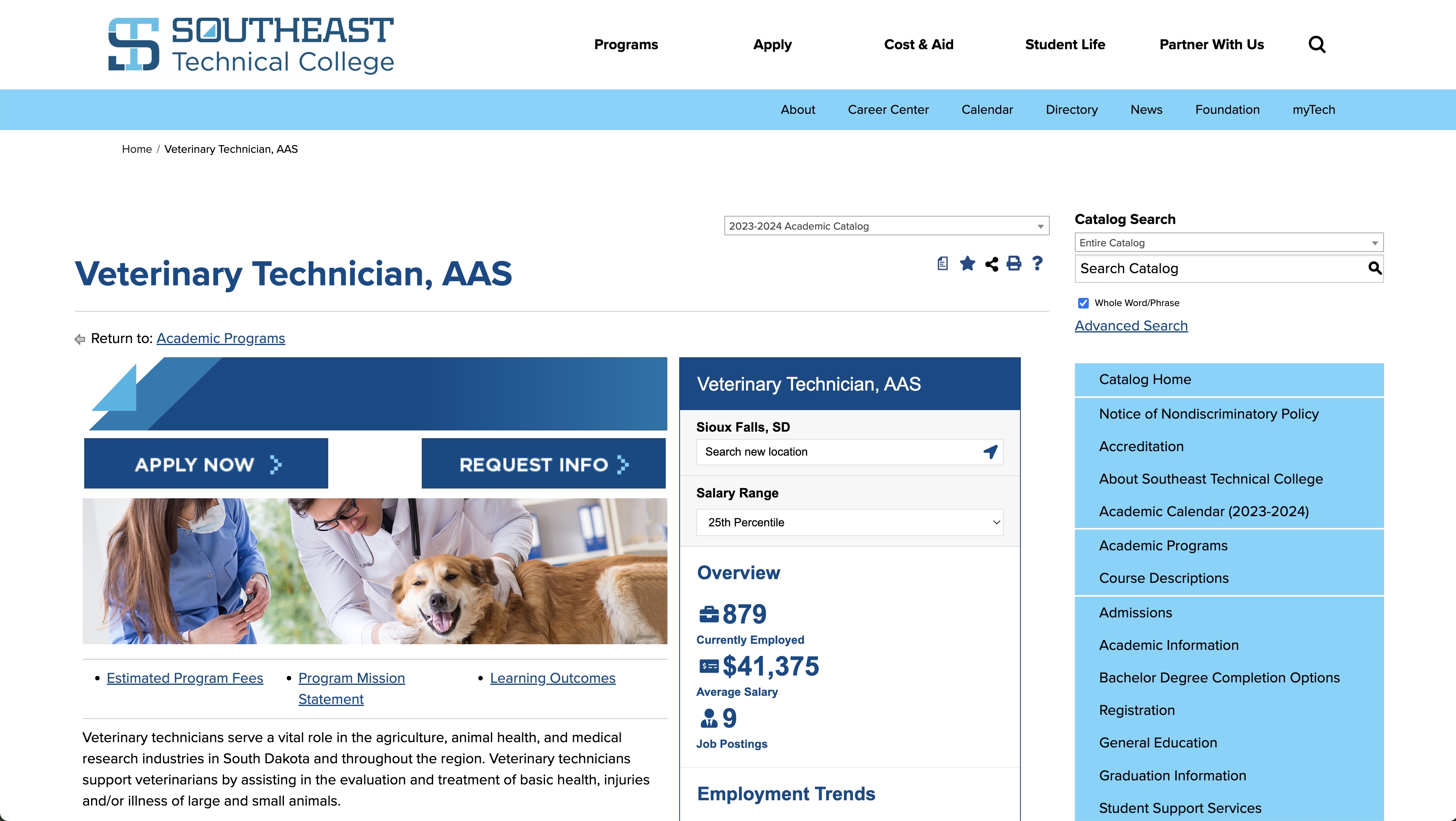
Southeast Technical College (STC) leverages its catalog to promote new programs and courses. With an engaging video showcasing its courses and campus life in the header banner, the center of the home page highlights features of new programs.
The clickable buttons on the top and right help viewers navigate the catalog easily. Clicking on academic programs leads you to program pages, where STC has included videos for all its programs to further engage visitors.
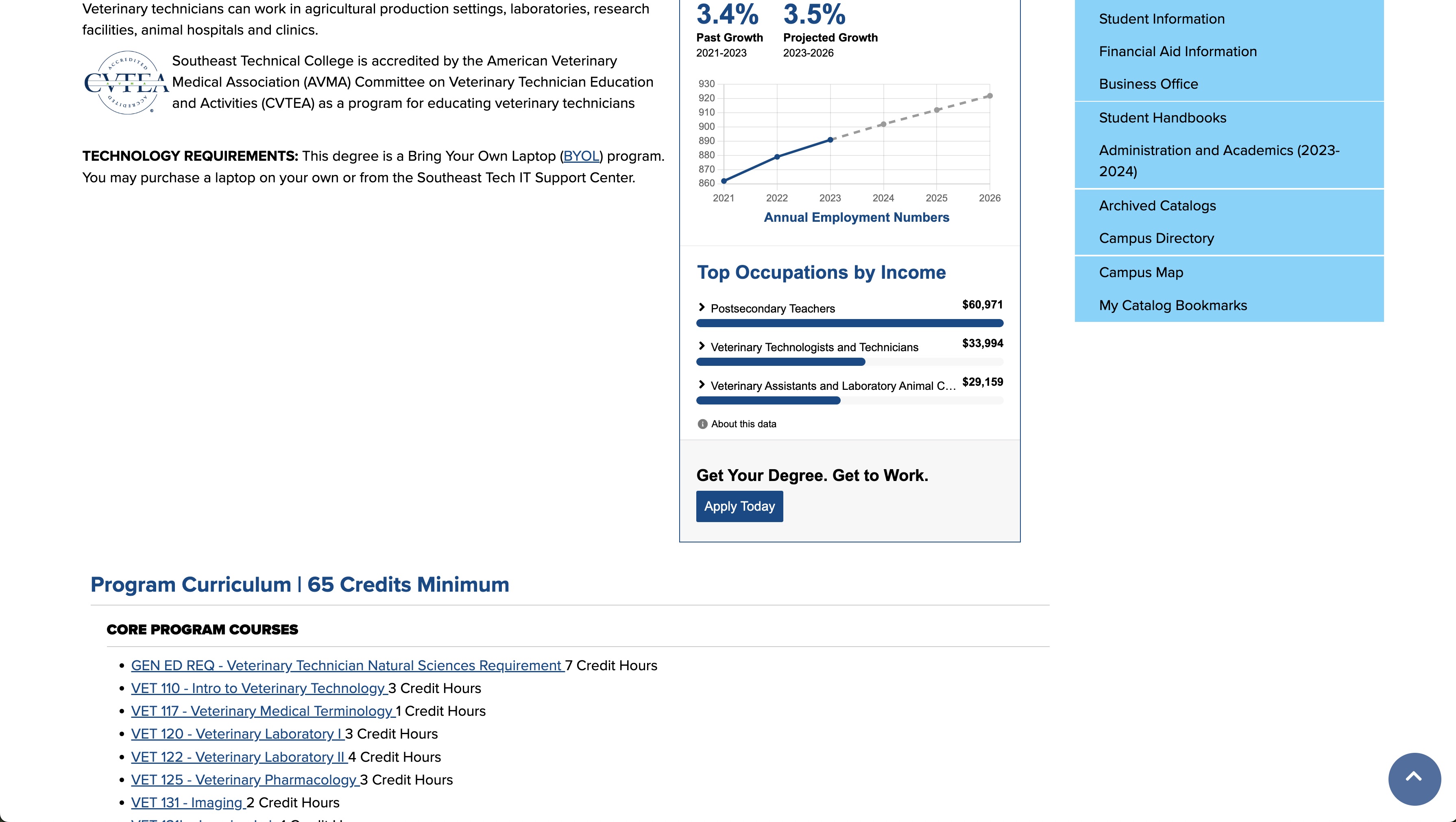
Program pages have the ‘Apply Now’ and ‘Request Info’ tabs on the top, which helps drive leads to admissions right from the catalog. The ‘Learning Outcomes,’ ‘Program Mission Statement’ and ‘Estimated Program Fees’ tabs present additional information without requiring visitors to leave the page. The page has additional helpful links; a link to course schedules helps students see when each course is offered and a link to the college bookstore tells visitors where they can buy test books.
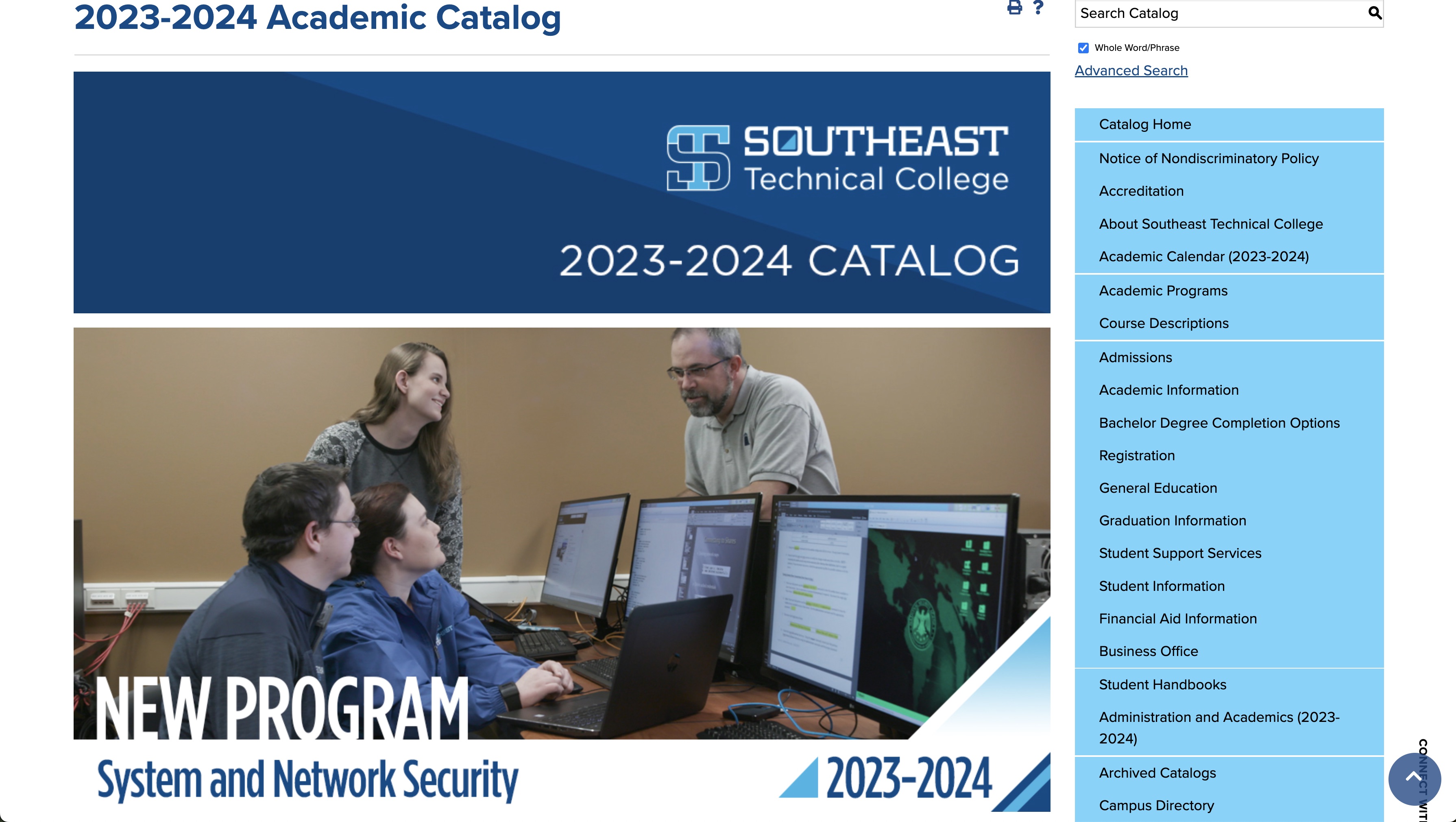
The STC catalog has integrated Career Pathways that shows up-to-date, accurate career information on program pages.
SUNY Onondaga Community College
Clean and functional, with a program spotlight
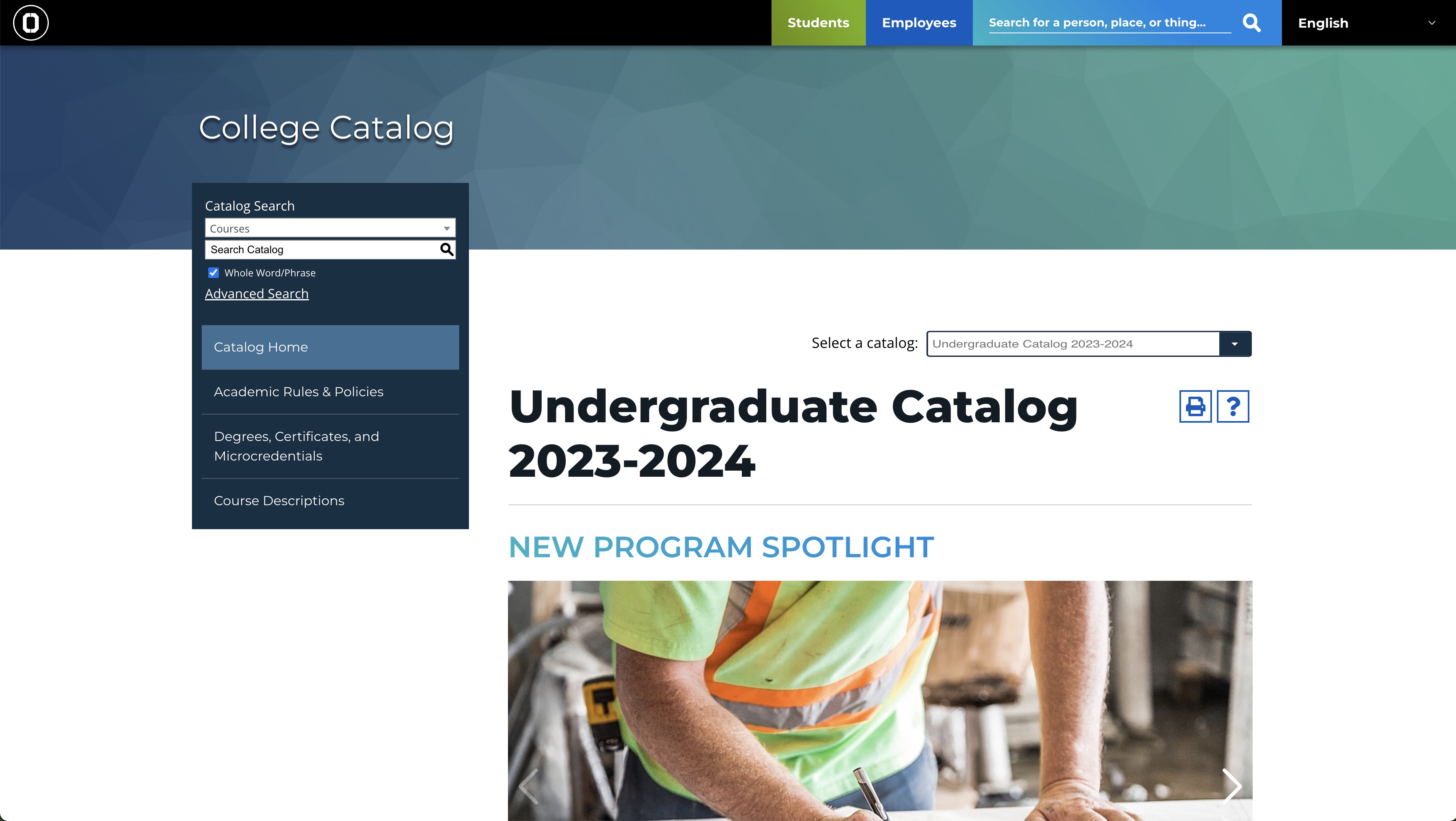
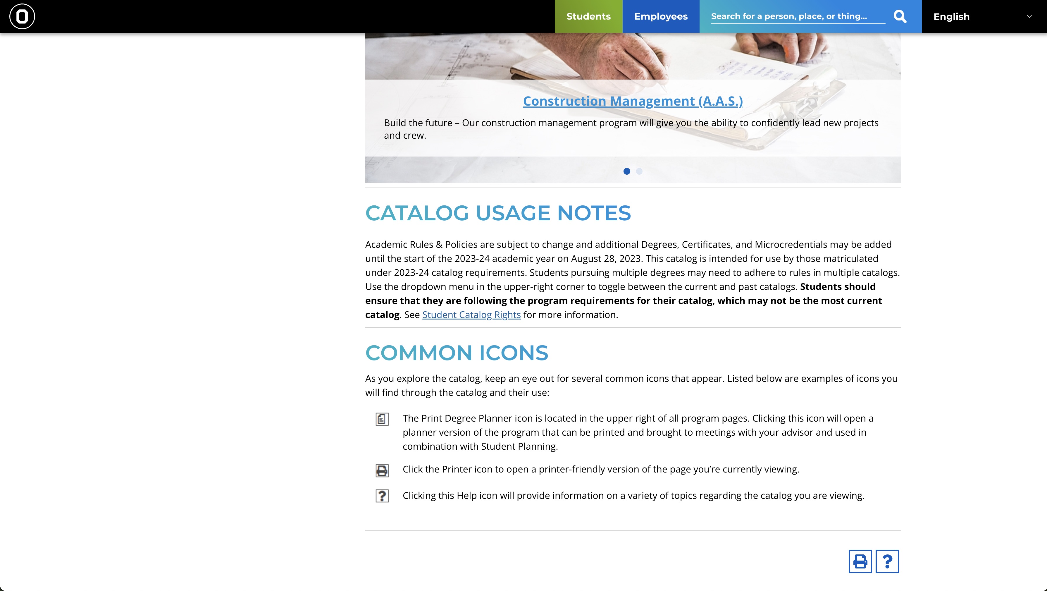
SUNY Onondaga Community College (SUNYOCC)’s catalog has a clean and function design — with a search bar at the top, tabs with important links on the left, and the current and previous years’ catalogs tucked into a drop down on the right, and a program spotlight of the page’s center. Following the program spotlight, the page shows important notes about the catalog and its usage.
The left-hand tabs have links to degrees, certificates and microcredentials. The catalog is easy to print thanks to its clear print icon.
Utah State University
Search-centered design
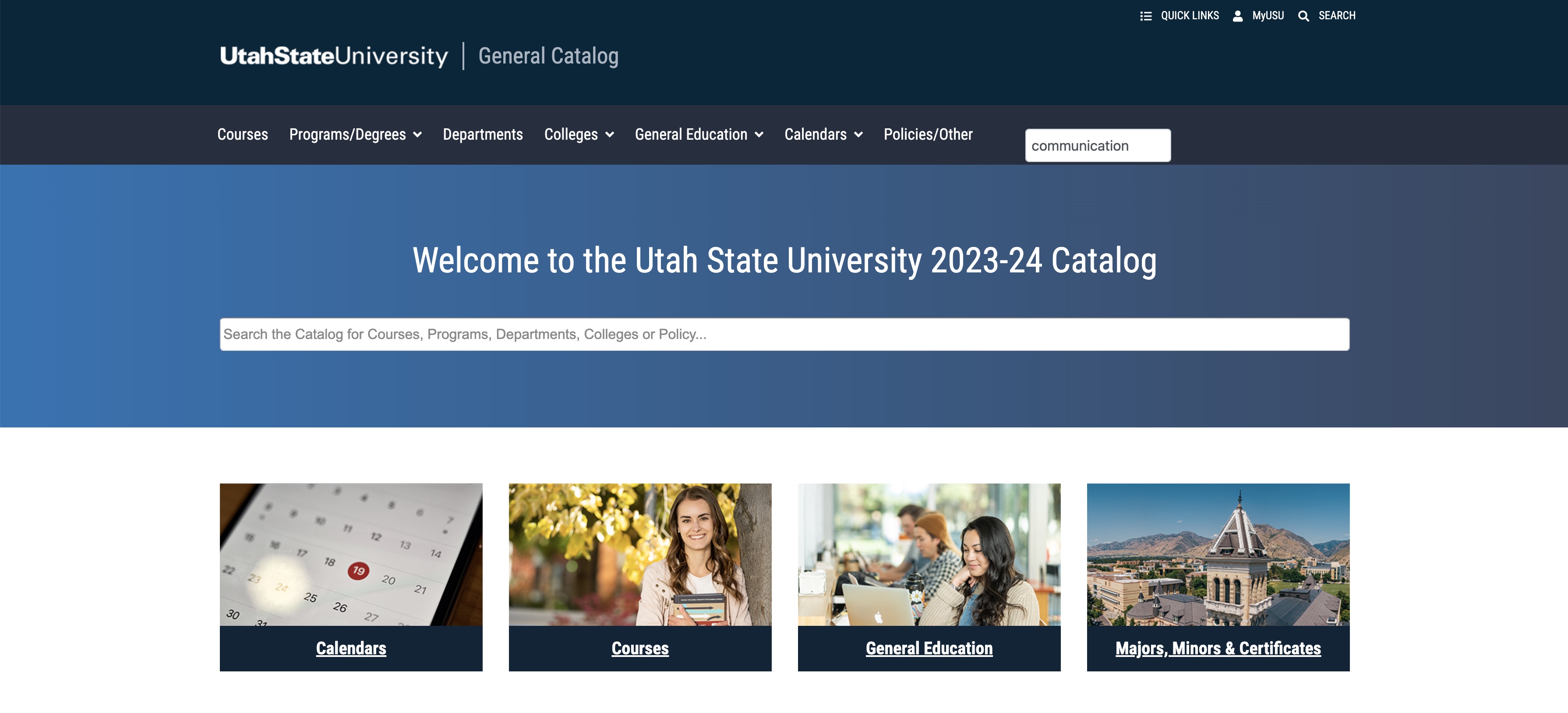
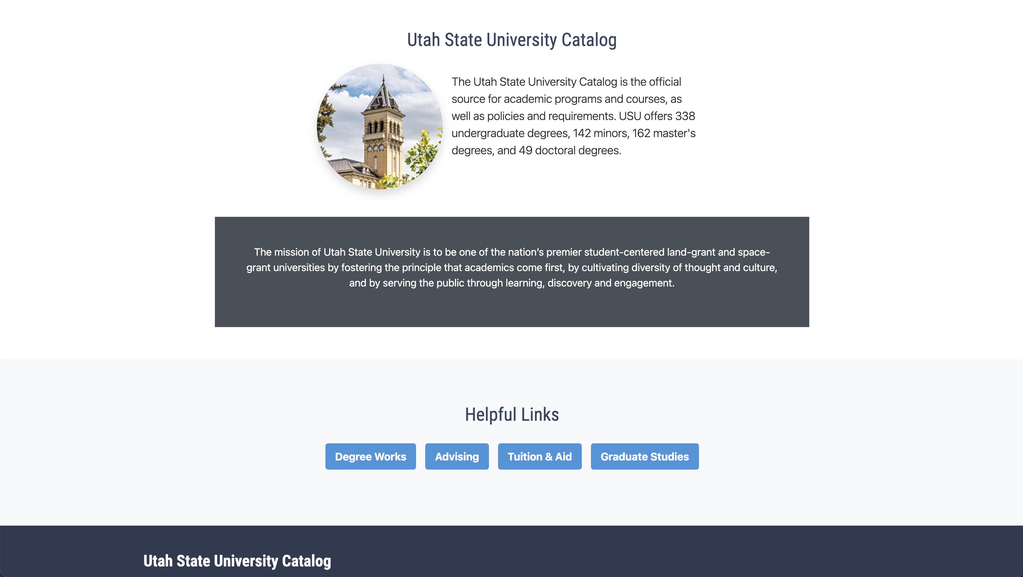
Utah State University’s (USU) catalog has a clean and functional design that is centered around search functionality. Rather than overwhelming with dozens of links and tabs, it has a prominent search bar at the center of the page followed by four tabs with key links and a statement of how many undergraduate, master’s and doctoral degrees USU offers.
The design effectively encourages site visitors to search for courses, programs, colleges and departments instead of navigating via links.
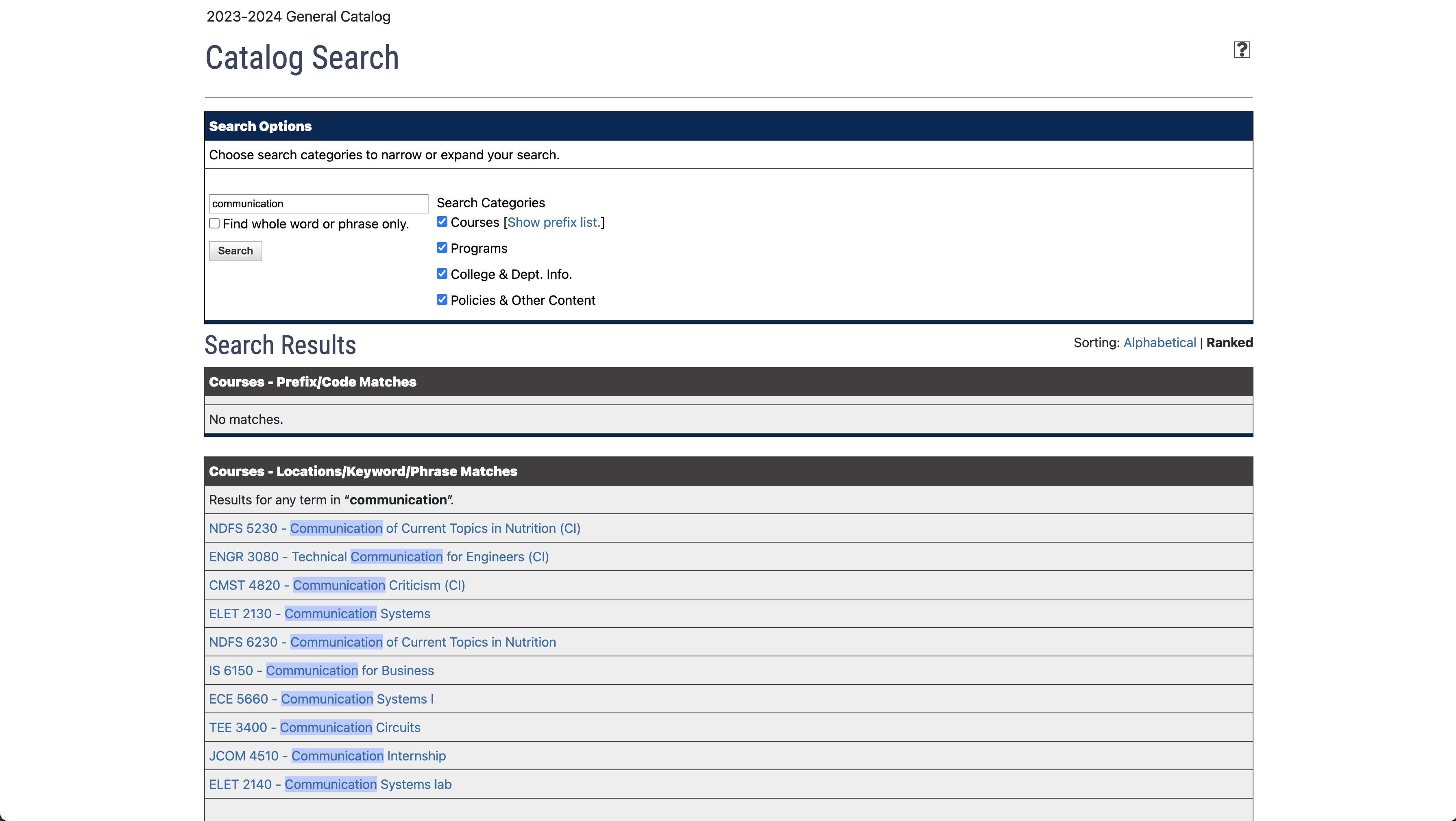
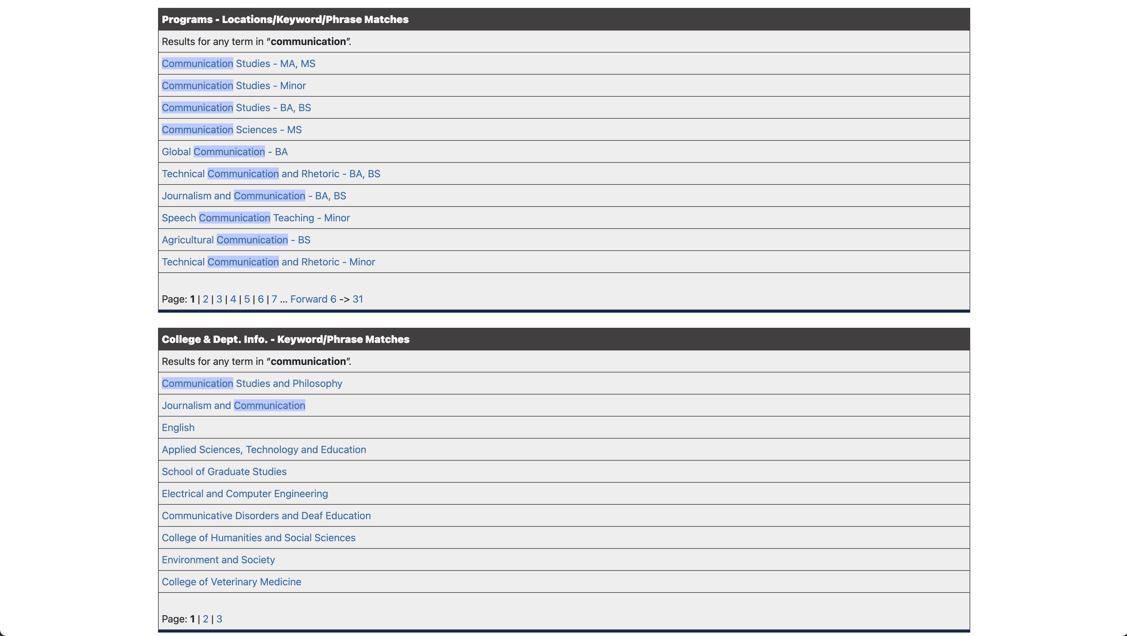
The catalog search results are incredibly effective. Results are filtered and segmented by courses, programs, colleges and policies, making it extremely easy for visitors to find their desired course or program.
Western Washington University
One-stop-shop with a program highlight
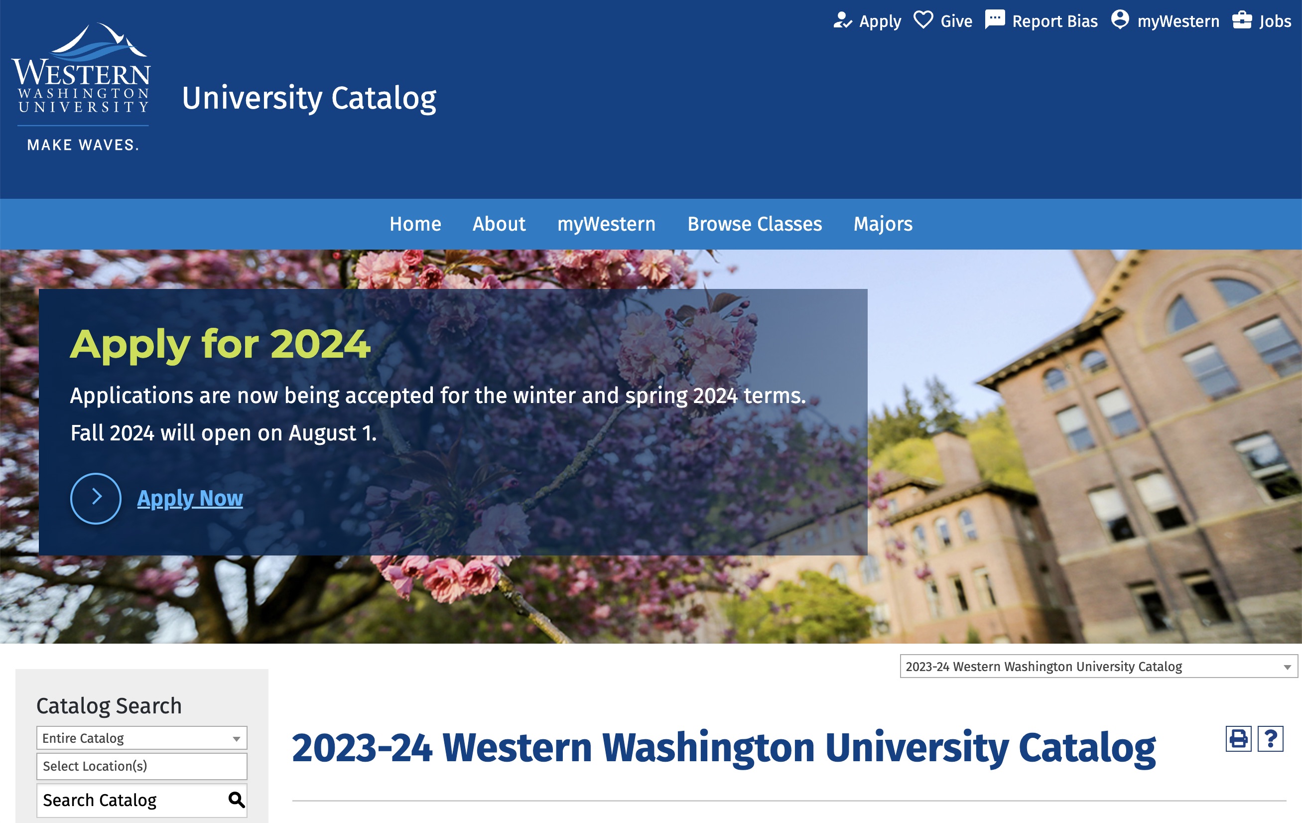
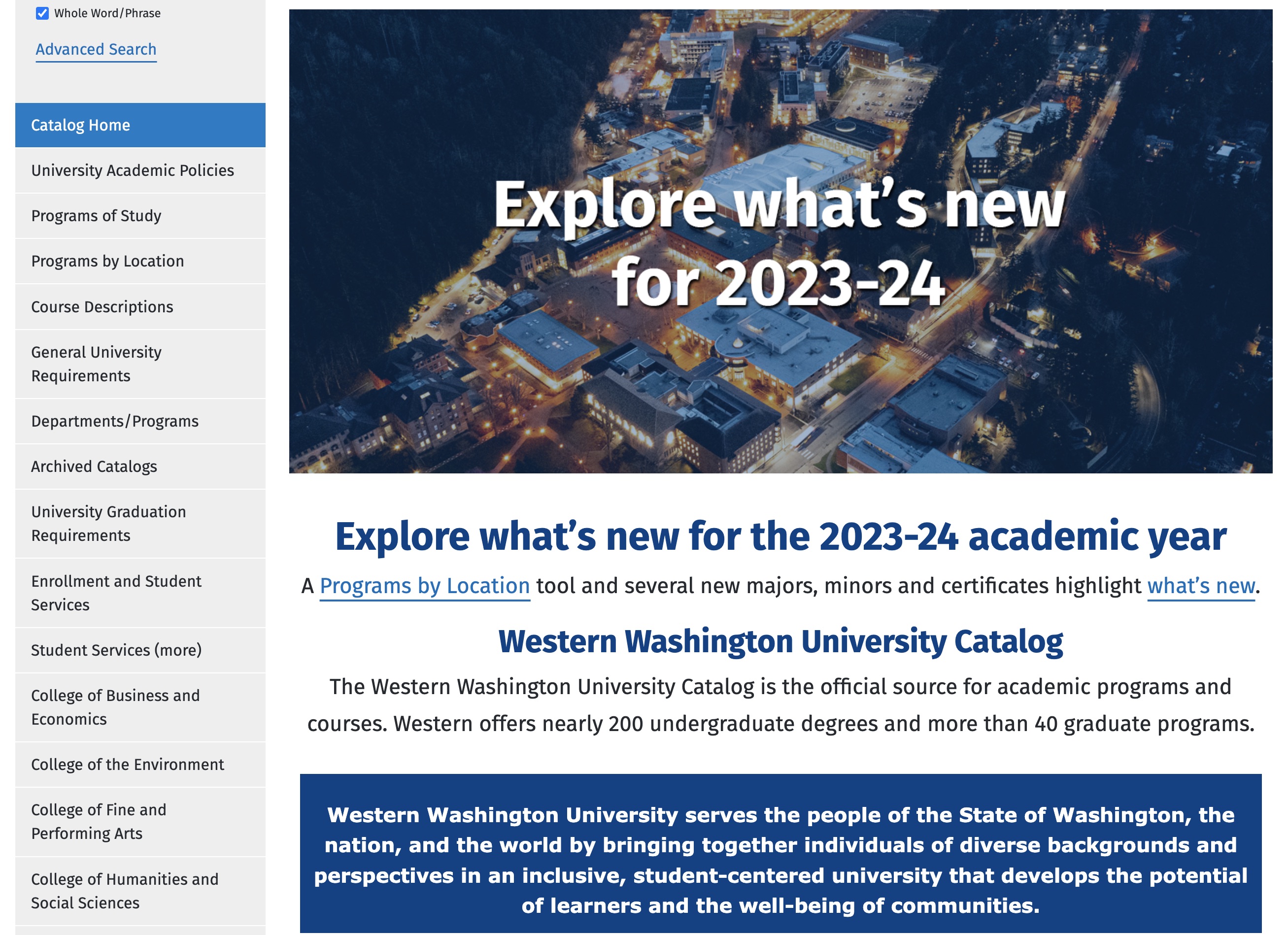
Western Washington University uses its catalog as a single source of truth for all students. It’s informative and educational. The university even showcases the catalog to first-year students during orientation and trains them to use it.
With all the most important links on the left, it has an ‘Explore What’s New for 2023-24’ section in the center, along with important dates and information about university requirements.
The ‘Explore What’s New’ section has all the university policy updates and program spotlights, which includes some new programs that the university is promoting with further links for additional information.
Winona State University
Visual and engaging catalog
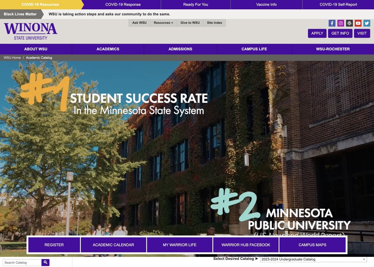
Winona State University has a highly engaging course catalog, with a video header that showcases what it’s like to be on campus and highlights the university’s top achievements.
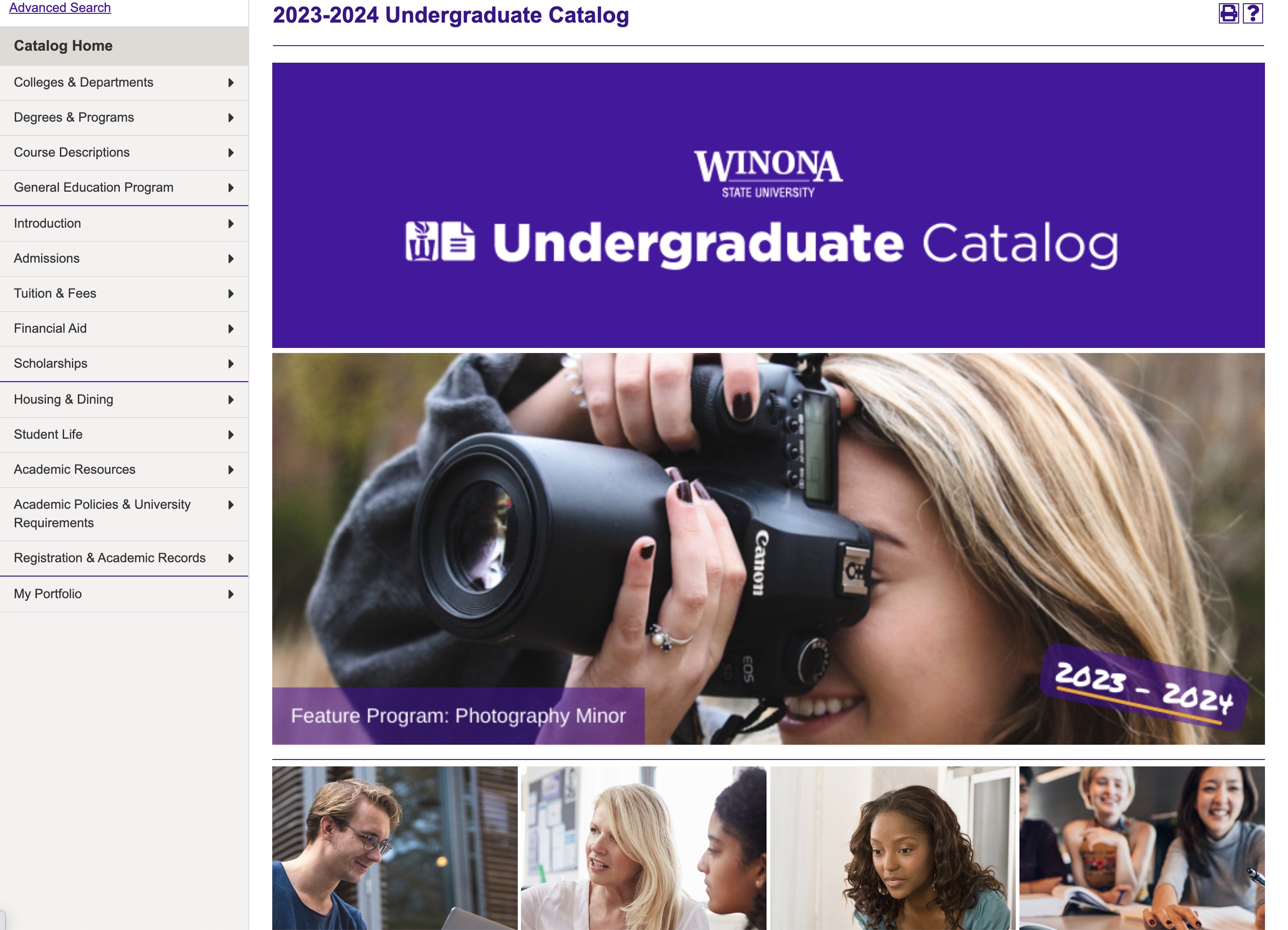
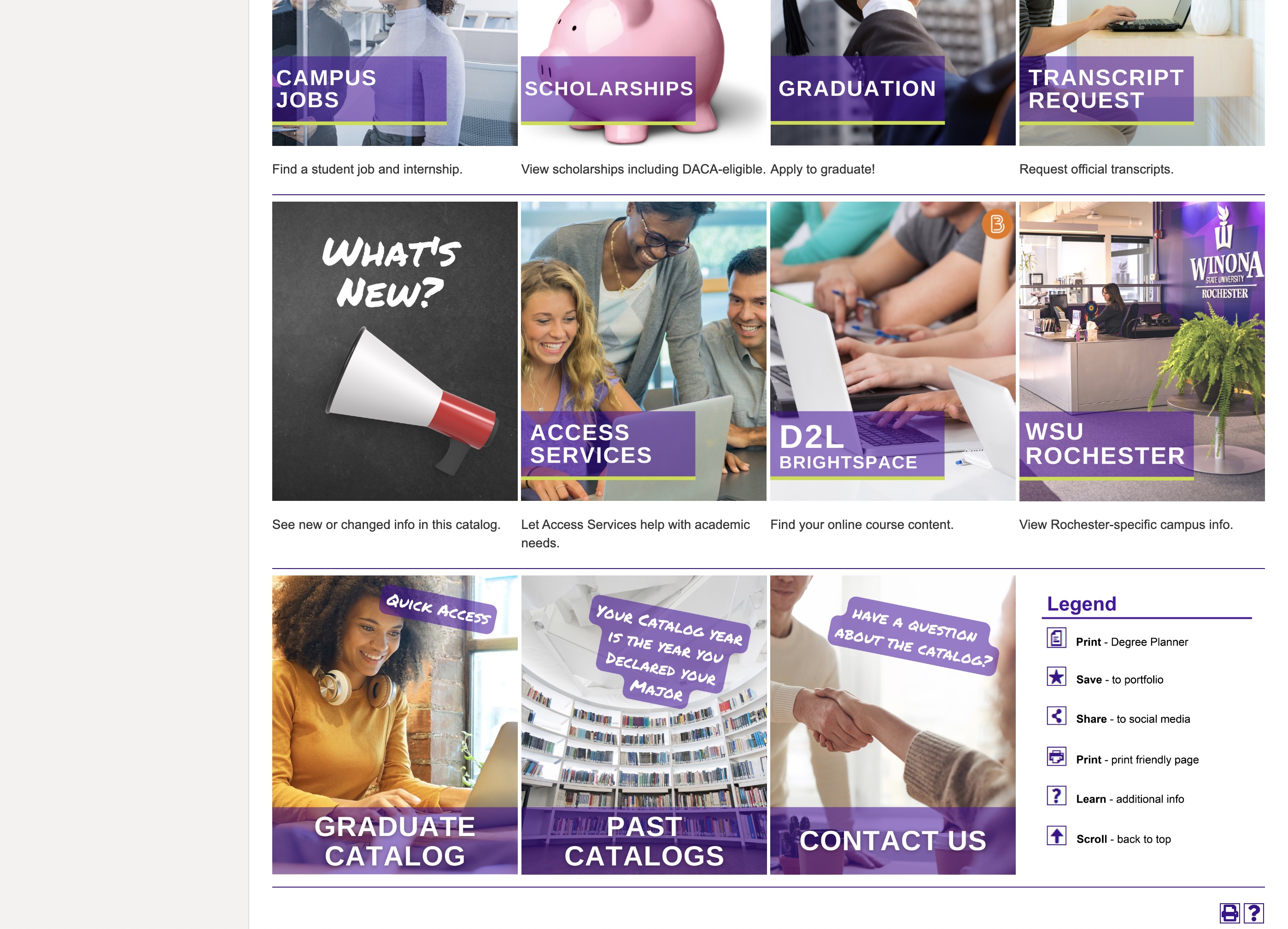
Right below the video header, WSU highlights all important links as large, clickable tiles with attractive images.
The tiles show links to everything a site visitor could be looking for – from academic advising to information about transferring, a link to the degree audit system and scholarships to what's new in the catalog, the current and past catalogs. It also has a link to the ‘Contact Us’ form.
Want to learn how you can use your catalog as a marketing tool?
Your college or university catalog can do a lot more than just deliver information about courses and programs. It can serve you as your best marketing tool if leveraged properly. Read our Quick Guide to Converting Your Course Catalog into a Marketing Tool to learn how you can unleash its true potential.
Last updated: November 20, 2023

